All Projects → envyN → ngx-widget-grid

envyN / ngx-widget-grid

Licence: MIT license
Angular 2.x or in general ng-x module for dashboards

Programming Languages

typescript
32286 projects
HTML
75241 projects
SCSS
7915 projects
javascript
184084 projects - #8 most used programming language
CSS
56736 projects

Projects that are alternatives of or similar to ngx-widget-grid

Angular Generic Table
A generic table for Angular 2+. Generic table uses standard markup for tables ie. table, tr and td elements etc. and has support for expanding rows, global search, filters, sorting, pagination, export to CSV, column clicks, custom column rendering, custom export values.
Stars: ✭ 100 (+53.85%)
Mutual labels:  grid, angular2, angular4
Ngx Datatable
✨ A feature-rich yet lightweight data-table crafted for Angular
Stars: ✭ 4,415 (+6692.31%)
Mutual labels:  grid, angular2, angular4
Drag select grid view
A grid that supports both dragging and tapping to select its items.
Stars: ✭ 100 (+53.85%)
Mutual labels:  widget, grid
Ka Table
Lightweight MIT React Table component for both TS and JS with Sorting, Filtering, Grouping, Virtualization, Editing and many more
Stars: ✭ 117 (+80%)
Mutual labels:  widget, grid
ng-data-picker
🏄🏼 A data picker based on Angular 4+ (like native datetime picker of iOS)
Stars: ✭ 24 (-63.08%)
Mutual labels:  angular2, angular4
paper-dashboard-angular
Angular version of the original Paper Dashboard.
Stars: ✭ 142 (+118.46%)
Mutual labels:  angular2, angular4
Flutter graphite
Flutter widget to draw interactive direct graphs (flowcharts) of any complexity in a tile rectangular manner.
Stars: ✭ 23 (-64.62%)
Mutual labels:  widget, grid
angular2-signature-pad
Signature pad component for Angular 2.x and above.
Stars: ✭ 17 (-73.85%)
Mutual labels:  angular2, angular4
Angular2gridster
Angular implementation of well known Gridster (no jQuery, no external libraries, only Angular and Rx.js).
Stars: ✭ 188 (+189.23%)
Mutual labels:  grid, angular2
nativescript-ng-shadow
Angular directive to apply shadows to native elements according to the elevation level guidelines of material design specification
Stars: ✭ 54 (-16.92%)
Mutual labels:  angular2, angular4
Dianoia-app
Mobile (Ionic 3 - Angular 4) app about non-pharmaceutical activities and information for people with dementia.
Stars: ✭ 13 (-80%)
Mutual labels:  angular2, angular4
ngx-redux-core
The modern redux integration for Angular 6+
Stars: ✭ 32 (-50.77%)
Mutual labels:  angular2, angular4
Vue Grid Layout
A draggable and resizable grid layout, for Vue.js.
Stars: ✭ 5,170 (+7853.85%)
Mutual labels:  widget, grid
Tabulator
Interactive Tables and Data Grids for JavaScript
Stars: ✭ 4,329 (+6560%)
Mutual labels:  widget, grid
Ngx Dashboard
Dashboard library for angular 4 and more
Stars: ✭ 70 (+7.69%)
Mutual labels:  widget, angular4
vue-smart-widget
🗃️Smart widget is a flexible and extensible content container component for Vue2.x / Vue3.x in Next branch.
Stars: ✭ 110 (+69.23%)
Mutual labels:  widget, grid
yii2-grid-view-library
Highly enhanced GridView widget and grid components for Yii2
Stars: ✭ 57 (-12.31%)
Mutual labels:  widget, grid
ng2-acl
Role based permissions for Angular v2++
Stars: ✭ 15 (-76.92%)
Mutual labels:  angular2, angular4
AuthGuard
Example repo for guarding routes post
Stars: ✭ 42 (-35.38%)
Mutual labels:  angular2, angular4
ng2-gridstack
A gridstack component for Angular2+
Stars: ✭ 12 (-81.54%)
Mutual labels:  angular2, angular4

ngx-widget-grid

codebeat badge

A flexible grid layout for responsive dashboards.

This library got its inspiration from angular-widget-grid and has been written as a pure Angular 2.x [+] module.

Demo: https://envyn.github.io/ngx-widget-grid

Installation

Install with npm:

$ npm install ngx-widget-grid

or with yarn

$ yarn add ngx-widget-grid

Add the ngx-widget-grid module as a dependency to your application module:

import { NgxWidgetGridModule } from 'ngx-widget-grid';

@NgModule({
  declarations: [
    ...
  ],
  imports: [
    ...
    NgxWidgetGridModule,
    ...
  ],
  bootstrap: [AppComponent]
})
export class AppModule { }

Usage

Minimal Example

<ngx-widget-grid [rows]="4" [columns]="5" [highlightNextPosition]="false"
                 [showGrid]="true" (widgetPositionChange)="onWidgetChange($event)">
  <ngx-widget [(position)]="{top: 2,left: 2,height: 1,width: 1}"
              [movable]="true" [resizable]="true">
    <div style="height:100%;width:100%; display:flex;">
      <div style="height:100%;width:100%; padding:10px; background-color: rgb(140, 198, 0);">
      </div>
    </div>
  </ngx-widget>
</ngx-widget-grid>

Minimal Example

Adding Traits

Widgets

position
<ngx-widget [(position)]="widget.position"></ngx-widget>

You can bind the position of the widget to data received from server so that even if the widget is moved, the new positions are always updated in the widget configuration.

movable
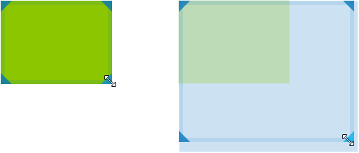
<ngx-widget [movable]="true" [(position)]="widget.position"></ngx-widget>

If movable is true, users will be able to move the respective widget.

Moving Widgets

resizable
<ngx-widget [resizable]="true" [(position)]="widget.position"></ngx-widget>

If resizable is true, users will be able to resize the respective widget.

Resizing Widgets

Optionally, you can limit the resize directions:

<ngx-widget [resizeDirections]="['NW', 'NE', 'E', 'SW']" [(position)]="widget.position"></ngx-widget>
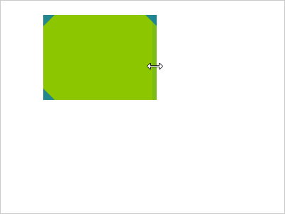
Restricted Resizing

swapOnMove
<ngx-widget [swapOnMove]="true" [(position)]="widget.position"></ngx-widget>

If swapOnMove is true, dragged widget will swap position and size with the widget over which the current one is dropped. Default is false which means, widget will be placed in the nearest available area.

Grid: Options

showGrid (default: false)
<ngx-grid columns="20" rows="15" [showGrid]="true">

Toggles the gridlines.

Gridlines Enabled

highlightNextPosition (default: false)
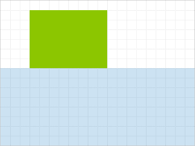
<ngx-grid columns="20" rows="15" [highlightNextPosition]="true">

Highlights the largest free area in the grid, if any. This area will be automatically assigned to the next widget with a falsy or conflicting position.

Highlight Next Position (1/2) Highlight Next Position (2/2)

Events

gridFull

The grid emits gridFullevent as true (when grid has been fully occupied) or false when there is still some space left in the grid, so that you can e.g. enable/disable UI elements accordingly.

<ngx-grid columns="20" rows="15" (gridFull)="onGridFull($event)">
function onGridFull(isGridFull) {
    if(isGridFull){
        //...
        //make add widget button disabled
        //...
    }else{
        //...
        //make add widget button enabled
        //...
    }
}
widgetPositionChange

Emitted whenever the position of a widget is changed. The event comes with an attached object argument, which contains the affected widget's index and its newPosition.

<ngx-grid columns="20" rows="15" (widgetPositionChange)="onWidgetChange($event)">

Functions

getNextPosition

getNextPosition is a function you could call to get details about the next available position that is being highlighted as part of highlightNextPosition.

Build (for developers/contributors)

  • Install yarn
  • Install dependencies
    yarn install
    
  • Build library
    yarn build-lib
    
  • Run
    yarn start
    
  • Build
    yarn build
    
  • Link
    cd dist && yarn link
    
  • Publish (from repo root directory)
    yarn publish:lib --new-version <version>
    

License

MIT

Note that the project description data, including the texts, logos, images, and/or trademarks, for each open source project belongs to its rightful owner. If you wish to add or remove any projects, please contact us at [email protected].