skydoves / Powermenu
Programming Languages
Projects that are alternatives of or similar to Powermenu
PowerMenu
🔥 The powerful and easiest way to implement modern material popup menu.
PowerMenu can be fully customized and used for popup dialogs.


Download


I really appreciate that 🔥Power Menu is used in more than 190,000+ project's dependency all over the 🌎world.

Gradle
Add below codes to your root build.gradle file (not your module build.gradle file).
allprojects {
    repositories {
        mavenCentral()
    }
}
And add a dependency code to your module's build.gradle file.
dependencies {
  implementation "com.github.skydoves:powermenu:2.1.9"
}
Table of Contents
1. PowerMenu
2. Customizing Popup
3. Preference
4. Menu Effect
5. Dialogs
6. Anchor
7. Background
8. Avoid Memory leak
9. Functions
10. Lazy initialization in Kotlin
Usage
Basic example
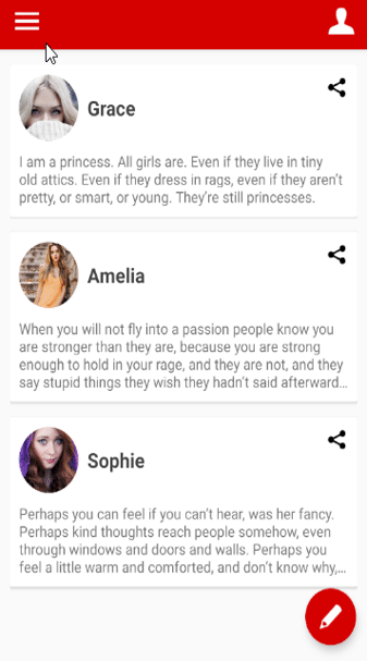
This is a basic example on a screenshot. Here is how to create PowerMenu using PowerMenu.Builder.
PowerMenu powerMenu = new PowerMenu.Builder(context)
          .addItemList(list) // list has "Novel", "Poerty", "Art"
          .addItem(new PowerMenuItem("Journals", false)) // add an item.
          .addItem(new PowerMenuItem("Travel", false)) // aad an item list.
          .setAnimation(MenuAnimation.SHOWUP_TOP_LEFT) // Animation start point (TOP | LEFT).
          .setMenuRadius(10f) // sets the corner radius.
          .setMenuShadow(10f) // sets the shadow.
          .setTextColor(ContextCompat.getColor(context, R.color.md_grey_800))
          .setTextGravity(Gravity.CENTER)
          .setTextTypeface(Typeface.create("sans-serif-medium", Typeface.BOLD))
          .setSelectedTextColor(Color.WHITE)
          .setMenuColor(Color.WHITE)
          .setSelectedMenuColor(ContextCompat.getColor(context, R.color.colorPrimary))
          .setOnMenuItemClickListener(onMenuItemClickListener)
          .build();
We can add an item or an item list using PowerMenuItem class. This is how to initialize PowerMenuItem.
new PowerMenuItem("Travel");
new PowerMenuItem("Poetery", false); // item name, isSelected (default is false).
new PowerMenuItem("Art", R.drawable.icon_art) // item name, item menu icon.
new PowerMenuItem("Travel", R.drawable.icon_travel, true) // item name, item menu icon, isSelected .
The first argument is an item title, and the other is selected status.
If isSelected is true, the item's text and the background color will be changed by settings like below.
.setSelectedTextColor(Color.WHITE) // sets the color of the selected item text.
.setSelectedMenuColor(ContextCompat.getColor(context, R.color.colorPrimary)) // sets the color of the selected menu item color.
OnMenuItemClickListener is for listening to the item click of the popup menu.
private OnMenuItemClickListener<PowerMenuItem> onMenuItemClickListener = new OnMenuItemClickListener<PowerMenuItem>() {
    @Override
    public void onItemClick(int position, PowerMenuItem item) {
        Toast.makeText(getBaseContext(), item.getTitle(), Toast.LENGTH_SHORT).show();
        powerMenu.setSelectedPosition(position); // change selected item
        powerMenu.dismiss();
    }
};
After implementing the listener, we should set using setOnMenuItemClickListener method.
.setOnMenuItemClickListener(onMenuItemClickListener)
The last, show the popup! Various show & dismiss methods.
powerMenu.showAsDropDown(view); // view is an anchor
Customizing Popup
We can customize item styles using CustomPowerMenu and your customized adapter.
Here is how to customize the popup item that has an icon.


Firstly, we should create our item model class.
public class IconPowerMenuItem {
    private Drawable icon;
    private String title;

    public IconPowerMenuItem(Drawable icon, String title) {
        this.icon = icon;
        this.title = title;
    }
 // --- skipped setter and getter methods
}
And we should create our customized XML layout and an adapter.
Custom Adapter should extend MenuBaseAdapter<YOUR_ITEM_MODEL_CLASS>.
public class IconMenuAdapter extends MenuBaseAdapter<IconPowerMenuItem> {

    @Override
    public View getView(int index, View view, ViewGroup viewGroup) {
        final Context context = viewGroup.getContext();

        if(view == null) {
            LayoutInflater inflater = (LayoutInflater) context.getSystemService(Context.LAYOUT_INFLATER_SERVICE);
            view = inflater.inflate(R.layout.item_icon_menu, viewGroup, false);
        }

        IconPowerMenuItem item = (IconPowerMenuItem) getItem(index);
        final ImageView icon = view.findViewById(R.id.item_icon);
        icon.setImageDrawable(item.getIcon());
        final TextView title = view.findViewById(R.id.item_title);
        title.setText(item.getTitle());
        return super.getView(index, view, viewGroup);
    }
}
The last, create the CustomPowerMenu with the onMenuItemClickListener.
CustomPowerMenu customPowerMenu = new CustomPowerMenu.Builder<>(context, new IconMenuAdapter())
       .addItem(new IconPowerMenuItem(ContextCompat.getDrawable(context, R.drawable.ic_wechat), "WeChat"))
       .addItem(new IconPowerMenuItem(ContextCompat.getDrawable(context, R.drawable.ic_facebook), "Facebook"))
       .addItem(new IconPowerMenuItem(ContextCompat.getDrawable(context, R.drawable.ic_twitter), "Twitter"))
       .addItem(new IconPowerMenuItem(ContextCompat.getDrawable(context, R.drawable.ic_line), "Line"))
       .setOnMenuItemClickListener(onIconMenuItemClickListener)
       .setAnimation(MenuAnimation.SHOWUP_TOP_RIGHT)
       .setMenuRadius(10f)
       .setMenuShadow(10f)
       .build();
private OnMenuItemClickListener<IconPowerMenuItem> onIconMenuItemClickListener = new OnMenuItemClickListener<IconPowerMenuItem>() {
    @Override
    public void onItemClick(int position, IconPowerMenuItem item) {
        Toast.makeText(getBaseContext(), item.getTitle(), Toast.LENGTH_SHORT).show();
        iconMenu.dismiss();
    }
};
Preference
PowerMenu supports saving of the last selected menu and recovering as lifecycle.
Here is how to save and recover selected menu.
return new PowerMenu.Builder(context)
    // saves the position automatically when the menu is selected.
    // If we set the same preference name on the other PowerMenus, they will share the saving position.
   .setPreferenceName("HamburgerPowerMenu")

    // invokes the listener automatically that has the saved position arguments along the lifecycle rule.
    // lifecycle rules should be ON_CREATE, ON_START or ON_RESUME.
    // in the below codes, the onMenuClickListener will be invoked when onCreate lifecycle.
   .setLifecycleOwner(lifecycleOwner)
   .setInitializeRule(Lifecycle.Event.ON_CREATE, 0) // Lifecycle.Event and default position.
   --- skips ---
Here are the methods related to preference.
.getPreferenceName() // gets the preference name of PowerMenu.
.getPreferencePosition(int defaultPosition) // gets the saved preference position from the SharedPreferences.
.setPreferencePosition(int defaultPosition) // sets the preference position name for persistence manually.
.clearPreference() // clears the preference name of PowerMenu.
Menu Effect
We can give two types of circular revealed animation effect.

Here is how to create a menu effect simply.
.setCircularEffect(CircularEffect.BODY) // shows circular revealed effects for all body of the popup menu.
.setCircularEffect(CircularEffect.INNER) // Shows circular revealed effects for the content view of the popup menu.
Dialogs
We can create looks like dialogs using PowerMenu.
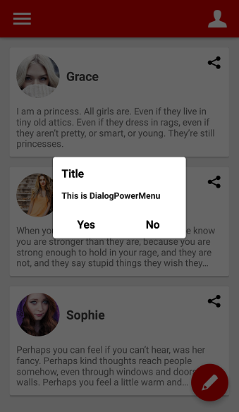
Here is an example of the normal dialog. Dialogs are composed of a header, footer, and body.
PowerMenu powerMenu = new PowerMenu.Builder(context)
           .setHeaderView(R.layout.layout_dialog_header) // header used for title
           .setFooterView(R.layout.layout_dialog_footer) // footer used for yes and no buttons
           .addItem(new PowerMenuItem("This is DialogPowerMenu", false)) // this is body
           .setLifecycleOwner(lifecycleOwner)
           .setAnimation(MenuAnimation.SHOW_UP_CENTER)
           .setMenuRadius(10f)
           .setMenuShadow(10f)
           .setWith(600)
           .setSelectedEffect(false)
           .build();
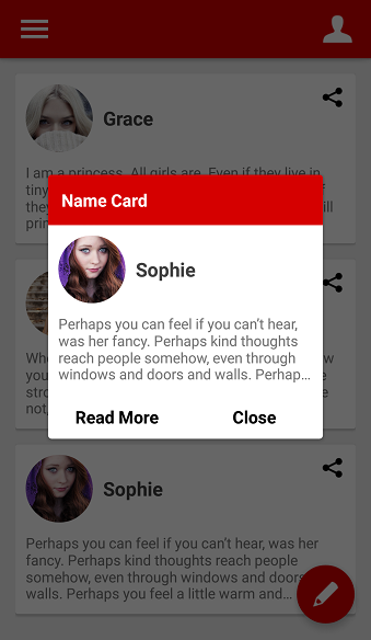
And we can create a customized dialog like below.
CustomPowerMenu customPowerMenu = new CustomPowerMenu.Builder<>(context, new CustomDialogMenuAdapter())
         setHeaderView(R.layout.layout_custom_dialog_header) // header used for title
        .setFooterView(R.layout.layout_custom_dialog_footer) // footer used for Read More and Close buttons
         // this is body
        .addItem(new NameCardMenuItem(ContextCompat.getDrawable(context, R.drawable.face3), "Sophie", context.getString(R.string.board3)))
        .setLifecycleOwner(lifecycleOwner)
        .setAnimation(MenuAnimation.SHOW_UP_CENTER)
        .setWith(800)
        .setMenuRadius(10f)
        .setMenuShadow(10f)
        .build();
Anchor
We can show the popup menu as drop down to the anchor.

.showAsAnchorLeftTop(view) // showing the popup menu as left-top aligns to the anchor.
.showAsAnchorLeftBottom(view) // showing the popup menu as left-bottom aligns to the anchor.
.showAsAnchorRightTop(view) // using with .setAnimation(MenuAnimation.SHOWUP_TOP_RIGHT) looks better
.showAsAnchorRightBottom(view) // using with .setAnimation(MenuAnimation.SHOWUP_TOP_RIGHT) looks better
.showAsAnchorCenter(view) // using with .setAnimation(MenuAnimation.SHOW_UP_CENTER) looks better
or we can control the position of the popup menu using the below methods.
.getContentViewWidth() // return popup's measured width
.getContentViewHeight() // return popup's measured height
like this :
// showing the popup menu at the center of an anchor. This is the same using .showAsAnchorCenter.
hamburgerMenu.showAsDropDown(view,
        view.getMeasuredWidth()/2 - hamburgerMenu.getContentViewWidth(),
       -view.getMeasuredHeight()/2 - hamburgerMenu.getContentViewHeight());
Background
These are options for the background.
.setShowBackground(false) // do not showing background.
.setTouchInterceptor(onTouchListener) // sets the touch listener for the outside of popup.
.setFocusable(true) // makes focusing only on the menu popup.
Avoid Memory leak
Dialog, PopupWindow and etc.. have memory leak issue if not dismissed before activity or fragment are destroyed.
But Lifecycles are now integrated with the Support Library since Architecture Components 1.0 Stable released.
So we can solve the memory leak issue so easily.
Just use setLifecycleOwner method. Then dismiss method will be called automatically before activity or fragment would be destroyed.
.setLifecycleOwner(lifecycleOwner)
Lazy initialization in Kotlin
We can initialize the PowerMenu property lazily using powerMenu keyword and PowerMenu.Factory abstract class.
The powerMenu extension keyword can be used in Activity and Fragment.
class MainActivity : AppCompatActivity() {

  private val moreMenu by powerMenu(MoreMenuFactory::class)

  //..
We should create a factory class which extends PowerMenu.Factory.
An implementation class of the factory must have a default(non-argument) constructor.
class MoreMenuFactory : PowerMenu.Factory() {

  override fun create(context: Context, lifecycle: LifecycleOwner?): PowerMenu {
    return createPowerMenu(context) {
      addItem(PowerMenuItem("Novel", true))
      addItem(PowerMenuItem("Poetry", false))
      setAutoDismiss(true)
      setLifecycleOwner(lifecycle)
      setAnimation(MenuAnimation.SHOWUP_TOP_LEFT)
      setTextColor(ContextCompat.getColor(context, R.color.md_grey_800))
      setTextSize(12)
      setTextGravity(Gravity.CENTER)
      setTextTypeface(Typeface.create("sans-serif-medium", Typeface.BOLD))
      setSelectedTextColor(Color.WHITE)
      setMenuColor(Color.WHITE)
      setInitializeRule(Lifecycle.Event.ON_CREATE, 0)
    }
  }
}
Functions
PowerMenu methods
.addItemList(list) // add a PowerMenuItem list.
.addItem(new PowerMenuItem("Journals", false)) // add a PowerMenuItem.
.addItem(3, new PowerMenuItem("Travel", false)) // add a PowerMenuItem at position 3.
.setLifecycleOwner(lifecycleOwner) // set LifecycleOwner for preventing memory leak.
.setWith(300) // sets the popup width size.
.setHeight(400) // sets the popup height size.
.setMenuRadius(10f) // sets the popup corner radius.
.setMenuShadow(10f) // sets the popup shadow.
.setDivider(new ColorDrawable(ContextCompat.getColor(context, R.color.md_blue_grey_300))) // sets a divider.
.setDividerHeight(1) // sets the divider height.
.setAnimation(MenuAnimation.FADE) // sets animations of the popup. It will start up when the popup is showing.
.setTextColor(ContextCompat.getColor(context, R.color.md_grey_800)) // sets the color of the default item text.
.setTextSize(12) // sets a text size of the item text
.setTextGravity(Gravity.CENTER) // sets a gravity of the item text.
.setTextTypeface(Typeface.create("sans-serif-medium", Typeface.BOLD)) // sets a typeface of the item text
.setSelectedTextColor(Color.WHITE) // sets the color of the selected item text.
.setMenuColor(Color.WHITE) // sets the color of the menu item color.
.setSelectedMenuColor(ContextCompat.getColor(context, R.color.colorPrimary)) // sets the color of the selected menu item color.
.setSelectedEffect(false) // sets the selected effects what changing colors of the selected menu item.
.setOnMenuItemClickListener(onMenuItemClickListener) // sets an item click listener.
.setOnDismissListener(OnDismissedListener onDismissListener) // sets a menu dismiss listener.
.setHeaderView(View view) //  sets the header view of the popup menu list.
.setHeaderView(int layout) // sets the header view of the popup menu using layout.
.setFooterView(View view) // sets the footer view of the popup menu list.
.setFooterView(int layout) // sets the footer view of the popup menu using layout.
.setSelection(int position) // sets the selected position of the popup menu. It can be used for scrolling as the position.
.getSelectedPosition() // gets the selected item position. if not selected before, returns -1 .
.getHeaderView() // gets the header view of the popup menu list.
.getFooterView() // gets the footer view of the popup menu list.
.getMenuListView() // gets the ListView of the popup menu.
Background methods
.setBackgroundAlpha(0.7f) // sets the alpha of the background.
.setBackgroundColor(Color.GRAY) // sets the color of the background.
.setShowBackground(false) // sets the background is showing or not.
.setOnBackgroundClickListener(onClickListener) // sets the background click listener of the background.
Show & Dismiss
.showAsDropDown(View anchor); // showing the popup menu as drop down to the anchor.
.showAsDropDown(View anchor, -370, 0); // showing the popup menu as drop down to the anchor with x-off and y-off.
.showAtCenter(View layout); // showing the popup menu as center aligns to the anchor.
.showAtCenter(View layout, 0, 0); // showing the popup menu as center aligns to the anchor with x-off and y-off.
.showAtLocation(View anchor, int xOff, int yOff) // showing the popup menu as center aligns to the anchor with x-off and y-off.
.showAtLocation(View anchor, int gravity, int xOff, int yOff) // showing the popup menu to the specific location to the anchor with Gravity.
.isShowing(); // gets the popup is showing or not.
.dismiss(); // dismiss the popup.
Find this library useful? ❤️
Support it by joining stargazers for this repository. ⭐️
And follow me for my next creations! 🤩
License
Copyright 2017 skydoves

Licensed under the Apache License, Version 2.0 (the "License");
you may not use this file except in compliance with the License.
You may obtain a copy of the License at

   http://www.apache.org/licenses/LICENSE-2.0

Unless required by applicable law or agreed to in writing, software
distributed under the License is distributed on an "AS IS" BASIS,
WITHOUT WARRANTIES OR CONDITIONS OF ANY KIND, either express or implied.
See the License for the specific language governing permissions and
limitations under the License.