rishabhbhatia / React Native Awesome Alerts
Licence: mit
Awesome alerts for React Native, works with iOS and Android.
Stars: ✭ 391
Programming Languages
javascript
184084 projects - #8 most used programming language
Projects that are alternatives of or similar to React Native Awesome Alerts
react-redux-modal-flex
[DEPRECATED] Make easy a modal/popup with Redux
Stars: ✭ 14 (-96.42%)
Mutual labels: alert, dialog, popup
Popupdialog
A simple, customizable popup dialog for iOS written in Swift. Replaces UIAlertController alert style.
Stars: ✭ 3,709 (+848.59%)
Mutual labels: dialog, alert, popup
Customalertviewdialogue
Custom AlertView Dialogue is the world's most advanced alert view library. Custom AlertView Dialogue includes simple message popups, confirmation alerts, selector popups, action sheet bottom menus, and input/feedback contact forms.
Stars: ✭ 100 (-74.42%)
Mutual labels: dialog, alert, popup
React Native Alert Pro
The Pro Version of React Native Alert (Android & iOS)
Stars: ✭ 69 (-82.35%)
Mutual labels: dialog, alert, popup
BalloonPopup
Forget Android Toast! BalloonPopup displays a round or squared popup and attaches it to a View, like a callout. Uses the Builder pattern for maximum ease. The popup can automatically hide and can persist when the value is updated.
Stars: ✭ 32 (-91.82%)
Mutual labels: alert, dialog, popup
Alertjs
Dialog Builder allows you to create fully customisable dialogs and popups in Dynamics 365.
Stars: ✭ 80 (-79.54%)
Mutual labels: dialog, alert, popup
Jquery Confirm
A multipurpose plugin for alert, confirm & dialog, with extended features.
Stars: ✭ 1,776 (+354.22%)
Mutual labels: dialog, alert, popup
Razor.SweetAlert2
A Razor class library for interacting with SweetAlert2
Stars: ✭ 98 (-74.94%)
Mutual labels: alert, dialog, popup
Sweetalert2
A beautiful, responsive, highly customizable and accessible (WAI-ARIA) replacement for JavaScript's popup boxes. Zero dependencies.
Stars: ✭ 13,929 (+3462.4%)
Mutual labels: dialog, alert, popup
mac-ibm-notifications
macOS agent used to display custom notifications and alerts to the end user.
Stars: ✭ 206 (-47.31%)
Mutual labels: alert, dialog, popup
Nativepopup
Clone of Apple iOS App's feedback popup, and easily customizable.
Stars: ✭ 247 (-36.83%)
Mutual labels: dialog, alert, popup
Sweetalert
A beautiful replacement for JavaScript's "alert"
Stars: ✭ 21,871 (+5493.61%)
Mutual labels: dialog, alert, popup
Jbox
jBox is a jQuery plugin that makes it easy to create customizable tooltips, modal windows, image galleries and more.
Stars: ✭ 1,251 (+219.95%)
Mutual labels: dialog, alert, popup
Alerttoast
Create Apple-like alerts & toasts using SwiftUI
Stars: ✭ 151 (-61.38%)
Mutual labels: dialog, alert, popup
Pmalertcontroller
PMAlertController is a great and customizable alert that can substitute UIAlertController
Stars: ✭ 2,397 (+513.04%)
Mutual labels: dialog, alert, popup
eins-modal
Simple to use modal / alert / dialog / popup. Created with pure JS. No javascript knowledge required! Works on every browser and device! IE9
Stars: ✭ 30 (-92.33%)
Mutual labels: alert, dialog, popup
Android-Dialog
Android Dialog(BaseDialog、AlertDialog、ProgressDialog、SuccessDdialog、ErrorDialog、BottomDialog)
Stars: ✭ 36 (-90.79%)
Mutual labels: alert, dialog
Aestheticdialogs
📱 An Android Library for 💫fluid, 😍beautiful, 🎨custom Dialogs.
Stars: ✭ 352 (-9.97%)
Mutual labels: dialog, popup
svelte-accessible-dialog
An accessible dialog component for Svelte apps
Stars: ✭ 24 (-93.86%)
Mutual labels: alert, dialog

React Native Awesome Alerts
Demo (Watch it on YouTube)
Getting Started
Installation
$ npm i react-native-awesome-alerts --save
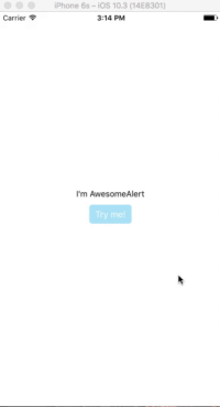
Basic Usage
import React from 'react';
import { StyleSheet, View, Text, TouchableOpacity } from 'react-native';

import AwesomeAlert from 'react-native-awesome-alerts';

export default class App extends React.Component {

  constructor(props) {
    super(props);
    this.state = { showAlert: false };
  };

  showAlert = () => {
    this.setState({
      showAlert: true
    });
  };

  hideAlert = () => {
    this.setState({
      showAlert: false
    });
  };

  render() {
    const {showAlert} = this.state;

    return (
      <View style={styles.container}>

        <Text>I'm AwesomeAlert</Text>
        <TouchableOpacity onPress={() => {
          this.showAlert();
        }}>
          <View style={styles.button}>
            <Text style={styles.text}>Try me!</Text>
          </View>
        </TouchableOpacity>

        <AwesomeAlert
          show={showAlert}
          showProgress={false}
          title="AwesomeAlert"
          message="I have a message for you!"
          closeOnTouchOutside={true}
          closeOnHardwareBackPress={false}
          showCancelButton={true}
          showConfirmButton={true}
          cancelText="No, cancel"
          confirmText="Yes, delete it"
          confirmButtonColor="#DD6B55"
          onCancelPressed={() => {
            this.hideAlert();
          }}
          onConfirmPressed={() => {
            this.hideAlert();
          }}
        />
      </View>
    );
  };
};

const styles = StyleSheet.create({
  container: {
    flex: 1,
    alignItems: 'center',
    justifyContent: 'center',
    backgroundColor: '#fff',
  },
  button: {
    margin: 10,
    paddingHorizontal: 10,
    paddingVertical: 7,
    borderRadius: 5,
    backgroundColor: "#AEDEF4",
  },
  text: {
    color: '#fff',
    fontSize: 15
  }
});
Props
Basic
| Prop | Type | Description | Default |
|---|---|---|---|
| show | boolean |
Show / Hide awesome alert | false |
| useNativeDriver | boolean |
Use native driver for animations | false |
| showProgress | boolean |
Show / Hide progress bar | false |
| title | string |
Title text to display | hidden |
| message | string |
Message text to display | hidden |
| closeOnTouchOutside | bool |
Dismiss alert on clicking outside | true |
| closeOnHardwareBackPress | bool |
Dismiss alert on hardware back press (android) | true |
| showCancelButton | bool |
Show a cancel button | false |
| showConfirmButton | bool |
Show a confirmation button | false |
| cancelText | string |
Cancel button text | Cancel |
| confirmText | string |
Confirm button text | Confirm |
| onCancelPressed | func |
Action to perform when Cancel is pressed | - |
| onConfirmPressed | func |
Action to perform when Confirm is pressed | - |
| onDismiss | func |
Callback for when alert is dismissed | - |
| customView | object |
Custom view to render inside alert | null |
| modalProps | object |
Additional props to pass for Modal | - |
Styling
| Prop | Type | Description | Default |
|---|---|---|---|
| alertContainerStyle | object |
Alert parent container style | - |
| overlayStyle | object |
Overlay style | - |
| progressSize | string |
Size of activity indicator | - |
| progressColor | string |
Color of activity indicator | - |
| contentContainerStyle | object |
Alert popup style | - |
| contentStyle | object |
Alert popup content style | - |
| titleStyle | object |
Title style | - |
| messageStyle | object |
Message style | - |
| actionContainerStyle | object |
Action container style | - |
| cancelButtonColor | string |
Background color | #D0D0D0 |
| confirmButtonColor | string |
Background color | #AEDEF4 |
| cancelButtonStyle | object |
Cancel button style | - |
| cancelButtonTextStyle | object |
Cancel button text style | - |
| confirmButtonStyle | object |
Confirm button style | - |
| confirmButtonTextStyle | object |
Confirm button text style | - |
Inspiration
Pedant: sweet-alert-dialog (Github)
Questions
Feel free to Contact me or Create an issue
License
Released under the Mit License
Note that the project description data, including the texts, logos, images, and/or trademarks,
for each open source project belongs to its rightful owner.
If you wish to add or remove any projects, please contact us at [email protected].