WorldDownTown / Rangeseekslider
Programming Languages
Projects that are alternatives of or similar to Rangeseekslider
RangeSeekSlider
Overview
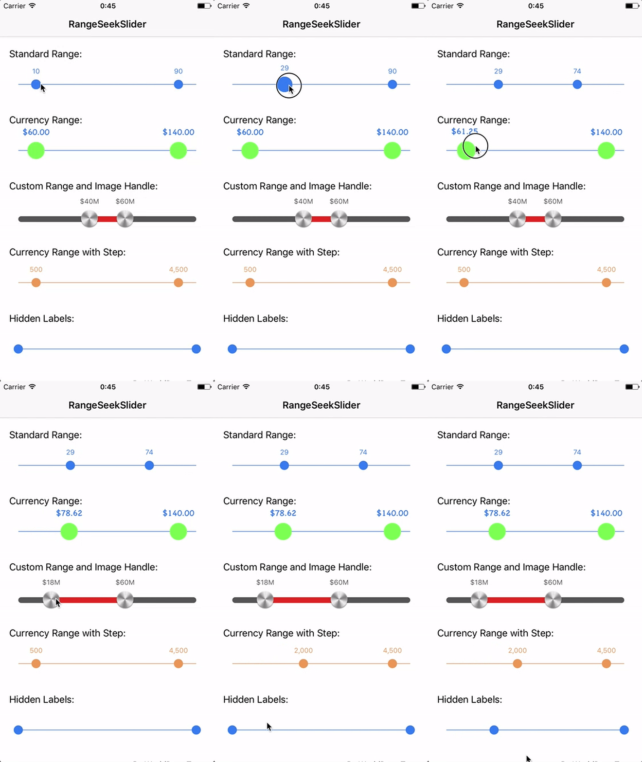
RangeSeekSlider provides a customizable range slider like a UISlider.
This library is based on TomThorpe/TTRangeSlider (Objective-C) and made with Swift.
Demo
You can try on Appetize.io
or
Build Xcode project.
- Open RangeSeekSlider.xcodeproj.
- Change Scheme to
RangeSeekSliderDemo - Run
Usage
Add the RangeSeekSlider like you would with any other UIControl. Either:
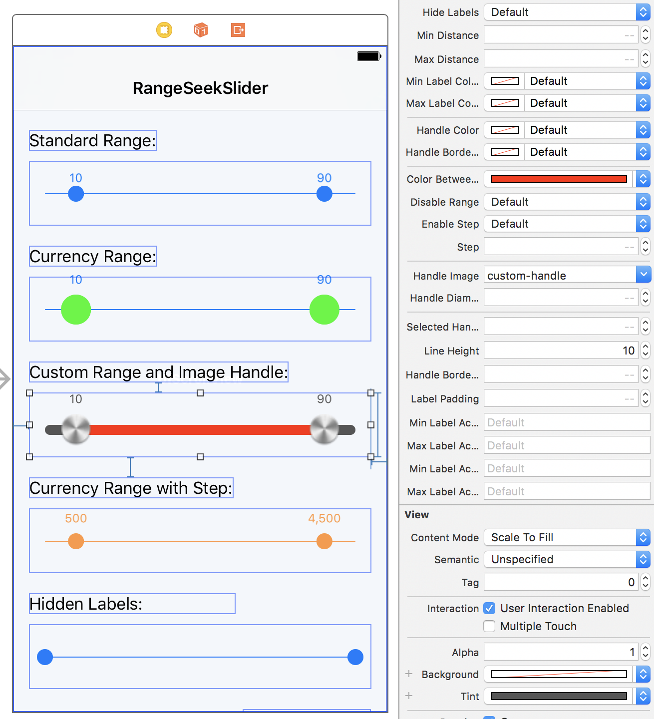
- Add a view in your storyboard/xib and change its
ClassandModuletoRangeSeekSlider. You can set all the properties in the Attributes Inspector and see a live preview:
or
- Create the
RangeSeekSliderin code usingRangeSeekSlider()then add it as a subview to your code and set the relevant autolayout properties or frame.
The default slider ranges from 0.0 -> 100.0 and has 10.0 preselected as the minimum, and 90.0 as the maximum.
Values that the user has selected are exposed using the selectedMinValue and selectedMaxValue properties. You can also use these properties to change the selected values programatically if you wish.
Other customisation of the control is done using the following properties:
tintColor
The tintColor property (which you can also set in Interface Builder) sets the overall color of the control, including the color of the line, the two handles, and the labels.
It is safe to change the tintColor at any time, if the control is currently visible the color change will be animated into the new color.
minValue
The minimum possible value to select in the range
maxValue
The maximum possible value to select in the range
selectedMinValue
The preselected minumum value (note: This should be less than the selectedMaxValue)
selectedMaxValue
The preselected maximum value (note: This should be greater than the selectedMinValue)
minLabelFont
The font of the minimum value text label. If not set, the default is system font size 12.0.
maxLabelFont
The font of the maximum value text label. If not set, the default is system font size 12.0.
numberFormatter
Each handle in the slider has a label above it showing the current selected value. If you change number format, update each properties of NumberFormatter. By default, this is displayed as a decimal format.
hideLabels
When set to true the labels above the slider controls will be hidden. Default is false.
labelsFixed
Fixes the labels above the slider controls. If true, labels will be fixed to both ends. Otherwise labels will move with the handles. Default is false.
minDistance
The minimum distance the two selected slider values must be apart. Default is 0.0.
maxDistance
The maximum distance the two selected slider values must be apart. Default is CGFloat.greatestFiniteMagnitude.
minLabelColor
The color of the minimum value text label. If not set, the default is the tintColor.
maxLabelColor
The color of the maximum value text label. If not set, the default is the tintColor.
handleColor
If set it will update the color of the handles. Default is tintColor.
colorBetweenHandles
The colorBetweenHandles property sets the color of the line between the two handles.
handleBorderColor
If set it will update the color of the handle borders. Default is tintColor.
initialColor
The color of the entire slider when the handle is set to the minimum value and the maximum value. Default is nil.
disableRange
If true, the control will mimic a normal slider and have only one handle rather than a range.
In this case, the selectedMinValue will be not functional anymore. Use selectedMaxValue instead to determine the value the user has selected.
enableStep
If true the control will snap to point at each step (property) between minValue and maxValue. Default value is disabled.
step
If enableStep is true, this controls the value of each step. E.g. if this value is 20, the control will snap to values 20,40,60...etc. Set this is you enable the enableStep property.
handleImage
If set the image passed will be used for the handles.
handleDiameter
If set it will update the size of the handles. Default is 16.0.
selectedHandleDiameterMultiplier
If set it update the scaling factor of the handle when selected. Default is 1.7. If you don't want any scaling, set it to 1.0.
lineHeight
Set the height of the line. It will automatically round the corners. If not specified, the default value will be 1.0.
handleBorderWidth
If set it will update the size of the handle borders. Default is 0.0
labelPadding
If set it will update the size of the padding between label and handle. Default is 8.0
minLabelAccessibilityLabel
The label displayed in accessibility mode for minimum value handler. If not set, the default is empty String.
maxLabelAccessibilityLabel
The label displayed in accessibility mode for maximum value handler. If not set, the default is empty String.
minLabelAccessibilityHint
The brief description displayed in accessibility mode for minimum value handler. If not set, the default is empty String.
maxLabelAccessibilityHint
The brief description displayed in accessibility mode for maximum value handler. If not set, the default is empty String.
func setupStyle()
When subclassing RangeSeekSlider and setting each item in setupStyle(), the design is reflected in Interface Builder as well.

Requirements
- Swift 3.0+
- iOS 9.0+
Installation
Carthage
RangeSeekSlider is available through Carthage. To install it, simply add the following line to your Cartfile:
github "WorldDownTown/RangeSeekSlider"
⚠️Warning⚠️
When installed with Carthage, @IBDesignable can't be available (Carthage Issue). But we have a workaround is shown in Stack Overflow. It is able to use @IBDesignable by subclassing RangeSeekSlider.
@IBDesignable class CustomRangeSeekSlider: RangeSeekSlider {}
CocoaPods
RangeSeekSlider is available through CocoaPods. To install it, simply add the following line to your Podfile:
pod 'RangeSeekSlider'
Manually
Download and drop RangeSeekSlider/Sources folder in your project.
Author
WorldDownTown, [email protected]
License
RangeSeekSlider is available under the MIT license. See the LICENSE file for more info.


