aaron9000 / React Image Timeline
Licence: mit
📆 An image-centric timeline component for React.js
Stars: ✭ 77
Programming Languages
javascript
184084 projects - #8 most used programming language
Projects that are alternatives of or similar to React Image Timeline
Flutter advanced networkimage
flutter advanced network image provider
Stars: ✭ 282 (+266.23%)
Mutual labels: svg, image
Sharp
High performance Node.js image processing, the fastest module to resize JPEG, PNG, WebP, AVIF and TIFF images. Uses the libvips library.
Stars: ✭ 21,131 (+27342.86%)
Mutual labels: svg, image
Mojs
The motion graphics toolbelt for the web
Stars: ✭ 17,189 (+22223.38%)
Mutual labels: svg, timeline
Quick Picture Viewer
🖼️ Lightweight, versatile desktop image viewer for Windows. The best replacement for the default Windows photo viewer.
Stars: ✭ 237 (+207.79%)
Mutual labels: svg, image
Python Barcode
㊙️ Create standard barcodes with Python. No external dependencies. 100% Organic Python.
Stars: ✭ 241 (+212.99%)
Mutual labels: svg, image
Npm Gif
Replace NPM install's progress bar with a GIF!
Stars: ✭ 332 (+331.17%)
Mutual labels: image, npm
Svg Workshop
Materials for SVG Essentials & Animation Course
Stars: ✭ 612 (+694.81%)
Mutual labels: svg, timeline
Html To Image
✂️ Generates an image from a DOM node using HTML5 canvas and SVG.
Stars: ✭ 595 (+672.73%)
Mutual labels: svg, image
Contrast Swatch
🅰️ Image microservice for color contrast information
Stars: ✭ 210 (+172.73%)
Mutual labels: svg, image
Ruby Gem Downloads Badge
Clean and simple gem downloads count badge, courtesy of http://shields.io/. You can checkout the application directly at the following URL:
Stars: ✭ 29 (-62.34%)
Mutual labels: svg, image
Picasso
Picasso is a high quality 2D vector graphic rendering library. It support path , matrix , gradient , pattern , image and truetype font.
Stars: ✭ 205 (+166.23%)
Mutual labels: svg, image
Flagpack Core
Flagpack contains 260+ easily implementable flag icons to use in your design or code project.
Stars: ✭ 127 (+64.94%)
Mutual labels: svg, npm
Sqip
"SQIP" (pronounced \skwɪb\ like the non-magical folk of magical descent) is a SVG-based LQIP technique.
Stars: ✭ 3,074 (+3892.21%)
Mutual labels: svg, image
Qr Code With Logo
带头像(logo)的二维码(qrcode)生成工具,无jQuery依赖,自由调整大小
Stars: ✭ 104 (+35.06%)
Mutual labels: image, npm
React Native Blurhash
🖼️ A library to show colorful blurry placeholders while your content loads.
Stars: ✭ 430 (+458.44%)
Mutual labels: image, npm
Nuxt Optimized Images
🌅🚀 Automatically optimizes images used in Nuxt.js projects (JPEG, PNG, SVG, WebP and GIF).
Stars: ✭ 717 (+831.17%)
Mutual labels: svg, image

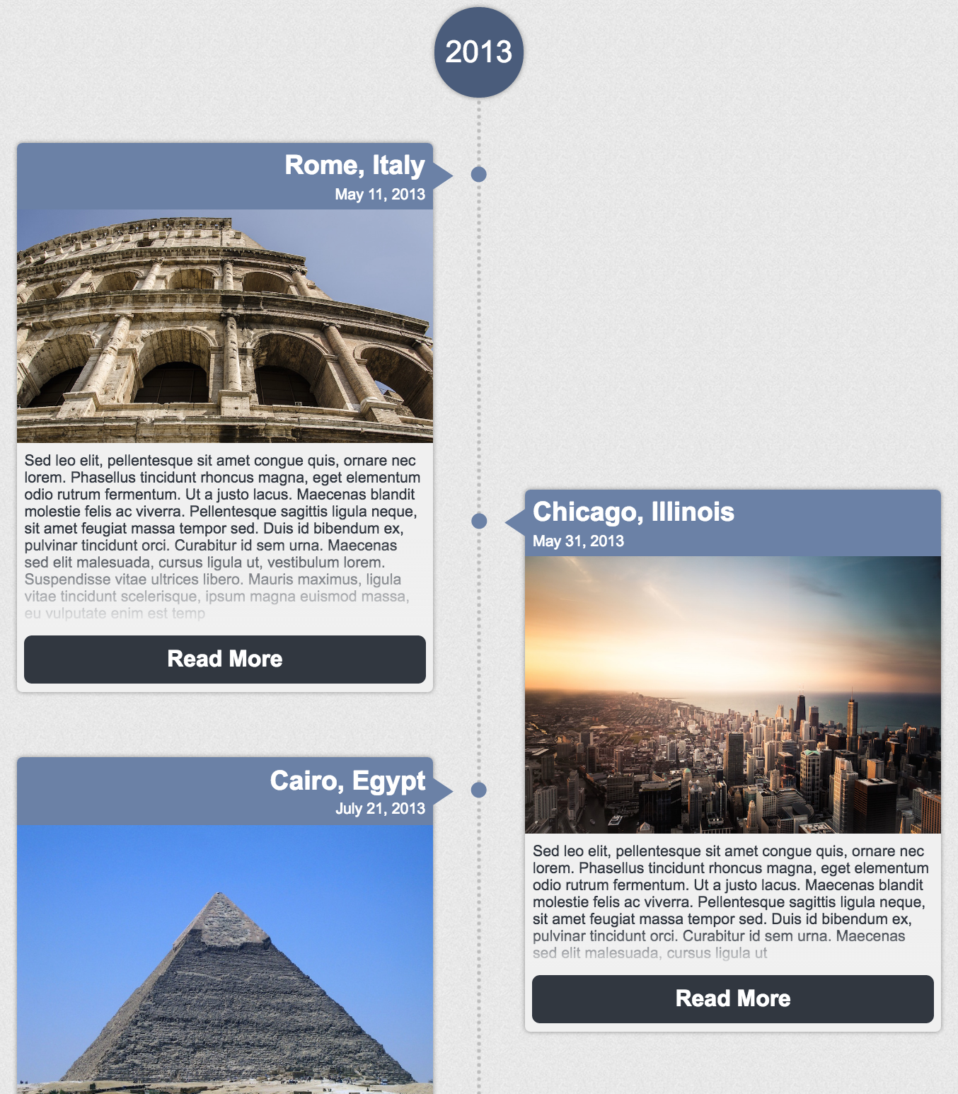
React Image Timeline
An image-centric timeline component for React.js. View chronological events in a pleasant way.
Features:
- Responsive layout
- Graceful handling of non-uniform content
- Customizable (use your own CSS and components)
- Memoized, pure, & typed (Typescript definitions included)
- Only 32kb
- Zero extra dependencies
How to Use
npm install react-image-timeline --save
import React from 'react';
import ReactDOM from 'react-dom';
import Timeline from 'react-image-timeline';
require('react-image-timeline/dist/timeline.css'); // .scss also available

const events = [
    {
        date: new Date(2013, 9, 27),
        text: "Sed leo elit, pellentesque sit amet congue quis, ornare nec lorem.",
        title: "Cairo, Egypt",
        buttonText: 'Click Me',
        imageUrl: "http://github.com/aaron9000/react-image-timeline/blob/master/src/assets/cairo.jpg?raw=true",
        onClick: console.log,
    }
];

ReactDOM.render(<Timeline events={events} />, document.getElementById('root'));
Customization
Custom Styles
To customize the timeline, add your own CSS to override the default styles.
Event Metadata
To pass extra data into custom components, use extras on TimelineEvent.
Custom Dot Pattern
The dots are defined in CSS using a base64-encoded image. Encode a new image and override the corresponding CSS class.
Custom Components
For more advanced customization, you can pass in custom components to replace the defaults. Custom components will be passed a TimelineEvent model in props.
const CustomHeader = (props) => {

    const {title, extras} = props.event;
    const {customField} = extras;

    return <div className="custom-header">
        <h1>{title}</h1>
        <p>{customField}</p>
    </div>;
};

ReactDOM.render(<Timeline events={events} customComponents={{header: CustomHeader}}/>, document.getElementById('root'));
Run Example Project (you will need create-react-app to run)
*install create-react-app*
*clone repository*
yarn
yarn --debug
yarn start
Run Tests
*clone repository*
yarn test
TypeScript & Models
Typescript definitions are included in the library.
Importing TypeScript Definitions
import {
    TimelineProps,
    TimelineEventProps,
    TimelineEvent,
    TimelineCustomComponents
} from 'react-image-timeline';
TimelineProps
export interface TimelineProps {
    customComponents?: TimelineCustomComponents | null;
    events: Array<TimelineEvent>;
    reverseOrder?: boolean;
    denseLayout?: boolean;
}
| Key | Type | Required? |
|---|---|---|
| events | Array | Yes |
| customComponents | TimelineCustomComponents | |
| reverseOrder | boolean | |
| denseLayout | boolean |
TimelineCustomComponents
export interface TimelineCustomComponents {
    topLabel?: React.PureComponent<TimelineEventProps> | React.ReactNode | null;
    bottomLabel?: React.PureComponent<TimelineEventProps> | React.ReactNode | null;
    header?: React.PureComponent<TimelineEventProps> | React.ReactNode | null;
    imageBody?: React.PureComponent<TimelineEventProps> | React.ReactNode | null;
    textBody?: React.PureComponent<TimelineEventProps> | React.ReactNode | null;
    footer?: React.PureComponent<TimelineEventProps> | React.ReactNode | null;
}
| Key | Type | Required? |
|---|---|---|
| topLabel | component | |
| bottomLabel | component | |
| header | component | |
| imageBody | component | |
| textBody | component | |
| footer | component |
TimelineEventProps
export interface TimelineEventProps {
    event: TimelineEvent;
}
| Key | Type | Required? |
|---|---|---|
| event | TimelineEvent | Yes |
TimelineEvent
export interface TimelineEvent {
    date: Date;
    title: string;
    imageUrl: string;
    text: string;
    onClick?: TimelineEventClickHandler | null;
    buttonText?: string | null;
    extras?: object | null;
}
| Key | Type | Required? |
|---|---|---|
| date | date | Yes |
| title | string | Yes |
| imageUrl | string | Yes |
| text | string | Yes |
| onClick | function | |
| buttonText | string | |
| extras | object |
Note that the project description data, including the texts, logos, images, and/or trademarks,
for each open source project belongs to its rightful owner.
If you wish to add or remove any projects, please contact us at [email protected].