jacklam718 / React Native Action Sheet Component
Licence: mit
React Native Action Sheet Component for iOS & Android.
Stars: ✭ 60
Programming Languages
javascript
184084 projects - #8 most used programming language
Projects that are alternatives of or similar to React Native Action Sheet Component
React Native Blur
React Native Blur component
Stars: ✭ 3,179 (+5198.33%)
Mutual labels: react-native-component
React Native Qrcode Scanner View
A highly customizable QR code scanning component for React Native
Stars: ✭ 658 (+996.67%)
Mutual labels: react-native-component
React Native Cached Image
CachedImage component for react-native
Stars: ✭ 890 (+1383.33%)
Mutual labels: react-native-component
React Native Material Menu
Pure JavaScript material menu component for React Native
Stars: ✭ 327 (+445%)
Mutual labels: react-native-component
Calendarpicker
CalendarPicker Component for React Native
Stars: ✭ 568 (+846.67%)
Mutual labels: react-native-component
React Native Sortable List
React Native Sortable List component
Stars: ✭ 678 (+1030%)
Mutual labels: react-native-component
React Native Mentions
Mentions textbox for React Native. Works on both ios and android. 🐳
Stars: ✭ 277 (+361.67%)
Mutual labels: react-native-component
React Arkit
AR library for React-Native based on ARKit
Stars: ✭ 57 (-5%)
Mutual labels: react-native-component
React Native Onboarding Swiper
🛳 Delightful onboarding for your React-Native app
Stars: ✭ 596 (+893.33%)
Mutual labels: react-native-component
React Native Stager
A performant wizard-like multi stages component for React Native without a router
Stars: ✭ 16 (-73.33%)
Mutual labels: react-native-component
React Native Drag Sort
🔥🔥🔥Drag and drop sort control for react-native
Stars: ✭ 397 (+561.67%)
Mutual labels: react-native-component
React Native Video Controls
A React Native video component with controls
Stars: ✭ 479 (+698.33%)
Mutual labels: react-native-component
React Native Star Rating
A React Native component for generating and displaying interactive star ratings
Stars: ✭ 724 (+1106.67%)
Mutual labels: react-native-component
React Native Gl Model View
📺 Display and animate textured Wavefront .OBJ 3D models with 60fps - native bridge to GLView (iOS) and jPCT-AE (Android)
Stars: ✭ 313 (+421.67%)
Mutual labels: react-native-component
React Native Circularprogress
A pure React Native Component for circular progress bars
Stars: ✭ 44 (-26.67%)
Mutual labels: react-native-component
React Native Maps Super Cluster
A Clustering-enabled map for React Native
Stars: ✭ 284 (+373.33%)
Mutual labels: react-native-component
React Native Material Bottom Navigation
💅🔧👌 a beautiful, customizable and easy-to-use material design bottom navigation for react-native
Stars: ✭ 659 (+998.33%)
Mutual labels: react-native-component
React Native Modal Dropdown
A react-native dropdown/picker/selector component for both Android & iOS.
Stars: ✭ 1,103 (+1738.33%)
Mutual labels: react-native-component
React Native Hide Show Password Input
React-Native Hide Show Password InputText Component
Stars: ✭ 50 (-16.67%)
Mutual labels: react-native-component
React Native Sglistview
SGListView is a memory minded implementation of React Native's ListView
Stars: ✭ 745 (+1141.67%)
Mutual labels: react-native-component
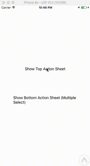
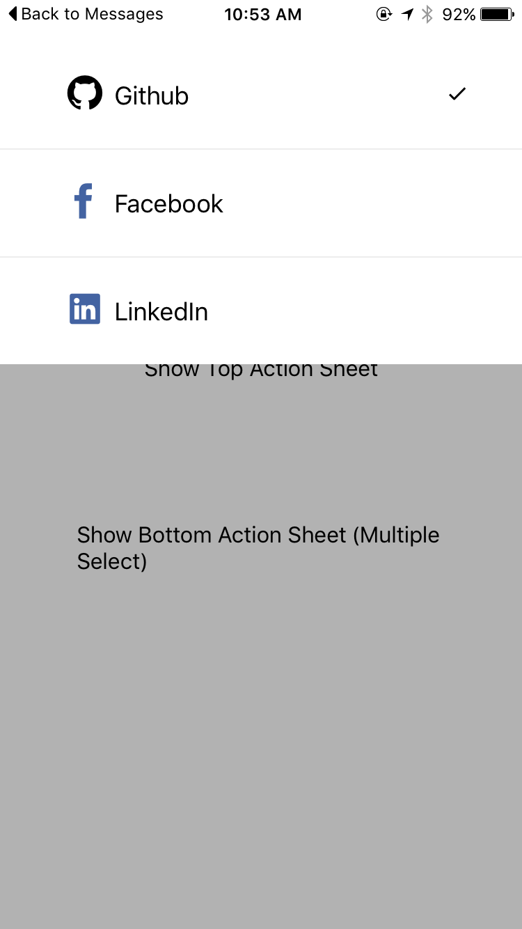
React Native Action Sheet Component
React Native Action Sheet Component for iOS & Android.
Pull request are welcomed. Please follow the Airbnb style guide Airbnb JavaScript
Preview
Installation
yarn
yarn add react-native-action-sheet-component
npm
npm install --save react-native-action-sheet-component
Usage with ActionSheetManager
import { EvilIcons, Ionicons } from '@exponent/vector-icons';
import ActionSheetManager { ActionSheet, ActionSheetItem } from 'react-native-action-sheet-component';
Options
const actionSheetItems = [
  <ActionSheetItem
    key='item-1'
    text="Github"
    value="github"
    selectedIcon={checkedIcon}
    icon={
      <EvilIcons name="sc-github" size={42} />
    }
    onPress={this.onItemPress}
  />,
  <ActionSheetItem
    key='item-2'
    text="Facebook"
    value="facebook"
    selectedIcon={checkedIcon}
    icon={
      <EvilIcons name="sc-facebook" color="#4363A2" size={42} />
    }
    onPress={this.onItemPress}
  />,
];

const options = {
  defaultValue: ['github'],
  children: actionSheetItems,
  onChange: (value, index, selectedData) => {
  },
}
Show
ActionSheetManager.show(options, () => {
  console.log('callback');
});
Update
ActionSheetManager.update(options, () => {
  console.log('callback');
});
Hide
ActionSheetManager.hide(() => {
  console.log('callback');
});
Usage with ActionSheet
import { EvilIcons, Ionicons } from '@exponent/vector-icons';
import { ActionSheet, ActionSheetItem } from 'react-native-action-sheet-component';
class Example extends Component {
  constructor(props) {
    super(props) {

      this.state = {
        defaultSelectedValues: ['github'],
      }
    }
  }

  render() {
    return (
      <View style={{ flex: 1, alignItems: 'center', justifyContent: 'center' }}>
        <ActionSheet
          ref={(actionSheet) => { this.topActionSheet = actionSheet; }}
          position="top"
          onChange={this.onChange}
          defaultValue={this.state.defaultSelectedValues}
          multiple
        >
          <ActionSheetItem
            text="Github"
            value="github"
            selectedIcon={checkedIcon}
            icon={
              <EvilIcons name="sc-github" size={42} />
            }
            onPress={this.onItemPress}
          />
          <ActionSheetItem
            text="Facebook"
            value="facebook"
            selectedIcon={checkedIcon}
            icon={
              <EvilIcons name="sc-facebook" color="#4363A2" size={42} />
            }
            onPress={this.onItemPress}
          />
        </ActionSheet>
      </View>
    )
  }
}
Show
actionSheet.show(() => {
  console.log('callback - show');
})
Hide
actionSheet.hide(() => {
  console.log('callback - hide');
})
Props
ActionSheet
| Prop | Type | Default | Note |
|---|---|---|---|
value? |
any |
null |
|
defaultValue? |
any |
null |
|
onShow? |
Function |
() => {} |
|
onHide? |
Function |
() => {} |
|
style? |
any |
null |
|
onChange? |
Function |
() => {} |
|
show? |
boolean |
false |
|
showSelectedIcon? |
boolean |
true |
|
multiple? |
boolean |
false |
|
hideOnSelected? |
boolean |
true |
|
hideOnSelceted? DEPRECATED
|
boolean |
true |
|
hideOnHardwareBackPress? |
boolean |
true |
|
showSeparator? |
boolean |
true |
|
showSparator? DEPRECATED
|
boolean |
true |
|
scrollEnabled? |
boolean |
true |
|
animationDuration? |
number |
250 |
|
overlayOpacity? |
number |
0.3 |
|
position? |
string |
top |
|
maxHeight? |
number |
Dimensions.get('window').height / 2 |
|
children? |
any |
null |
ActionSheetItem
| Prop | Type | Default | Note |
|---|---|---|---|
text |
any |
null |
|
icon? |
any |
null |
|
index? |
number |
null |
|
selectedIcon? |
number |
require('./img/checkmark.png') |
|
selected? |
boolean |
false |
|
showSelectedIcon? |
boolean |
true |
|
onPress? |
Function |
() => {} |
|
style? |
any |
null |
|
textStyle? |
any |
null |
Note that the project description data, including the texts, logos, images, and/or trademarks,
for each open source project belongs to its rightful owner.
If you wish to add or remove any projects, please contact us at [email protected].