nysamnang / React Native Alert Pro
Licence: mit
The Pro Version of React Native Alert (Android & iOS)
Stars: ✭ 69
Programming Languages
javascript
184084 projects - #8 most used programming language
Projects that are alternatives of or similar to React Native Alert Pro
Customalertviewdialogue
Custom AlertView Dialogue is the world's most advanced alert view library. Custom AlertView Dialogue includes simple message popups, confirmation alerts, selector popups, action sheet bottom menus, and input/feedback contact forms.
Stars: ✭ 100 (+44.93%)
Mutual labels: dialog, modal, alert, popup, box
Jbox
jBox is a jQuery plugin that makes it easy to create customizable tooltips, modal windows, image galleries and more.
Stars: ✭ 1,251 (+1713.04%)
Mutual labels: dialog, modal, alert, popup, confirm
Jquery Confirm
A multipurpose plugin for alert, confirm & dialog, with extended features.
Stars: ✭ 1,776 (+2473.91%)
Mutual labels: dialog, alert, popup, confirm
Popmodal
jquery plugin for showing tooltips, titles, modal dialogs and etc
Stars: ✭ 149 (+115.94%)
Mutual labels: dialog, modal, popup, confirm
Sweetalert2
A beautiful, responsive, highly customizable and accessible (WAI-ARIA) replacement for JavaScript's popup boxes. Zero dependencies.
Stars: ✭ 13,929 (+20086.96%)
Mutual labels: dialog, alert, popup, confirm
react-redux-modal-flex
[DEPRECATED] Make easy a modal/popup with Redux
Stars: ✭ 14 (-79.71%)
Mutual labels: alert, modal, dialog, popup
jquery.dialog.js
A lightweight replacement for the browser's default dialog boxes.
Stars: ✭ 17 (-75.36%)
Mutual labels: alert, modal, dialog, confirm
Popupdialog
A simple, customizable popup dialog for iOS written in Swift. Replaces UIAlertController alert style.
Stars: ✭ 3,709 (+5275.36%)
Mutual labels: dialog, modal, alert, popup
Razor.SweetAlert2
A Razor class library for interacting with SweetAlert2
Stars: ✭ 98 (+42.03%)
Mutual labels: alert, dialog, popup, confirm
Wc Messagebox
基于 Vue 2.0 开发的 Alert, Toast, Confirm 插件, UI仿照 iOS 原生
Stars: ✭ 203 (+194.2%)
Mutual labels: dialog, modal, alert, confirm
eins-modal
Simple to use modal / alert / dialog / popup. Created with pure JS. No javascript knowledge required! Works on every browser and device! IE9
Stars: ✭ 30 (-56.52%)
Mutual labels: alert, modal, dialog, popup
react-st-modal
Simple and flexible modal dialog component for React JS
Stars: ✭ 41 (-40.58%)
Mutual labels: alert, modal, dialog, confirm
Alertifyjs
A javascript framework for developing pretty browser dialogs and notifications.
Stars: ✭ 1,922 (+2685.51%)
Mutual labels: dialog, modal, alert, confirm
Pmalertcontroller
PMAlertController is a great and customizable alert that can substitute UIAlertController
Stars: ✭ 2,397 (+3373.91%)
Mutual labels: dialog, modal, alert, popup
Nativepopup
Clone of Apple iOS App's feedback popup, and easily customizable.
Stars: ✭ 247 (+257.97%)
Mutual labels: dialog, modal, alert, popup
Sweetalert
A beautiful replacement for JavaScript's "alert"
Stars: ✭ 21,871 (+31597.1%)
Mutual labels: dialog, modal, alert, popup
vue2-dialog
A mobile Vue plugin for VueDialog
Stars: ✭ 21 (-69.57%)
Mutual labels: alert, dialog, confirm
react-native-popup
React Native Animated Popup Modal
Stars: ✭ 19 (-72.46%)
Mutual labels: alert, modal, popup
vue-modal
A customizable, stackable, and lightweight modal component for Vue.
Stars: ✭ 96 (+39.13%)
Mutual labels: modal, dialog, popup
mac-ibm-notifications
macOS agent used to display custom notifications and alerts to the end user.
Stars: ✭ 206 (+198.55%)
Mutual labels: alert, dialog, popup
react-native-alert-pro


- Super lightweight component
- Smooth animation
- Beautiful
- Use method instead of state
- Work like a Pro
- Customize whatever you like
- Support all orientations
- Support both Android and iOS
| iOS | Android |
|---|---|
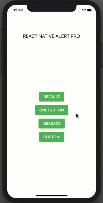 |
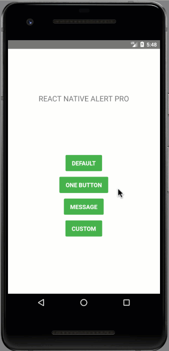 |
Installation
npm i react-native-alert-pro --save
or
yarn add react-native-alert-pro
Example
import React, { Component } from "react";
import { StyleSheet, View, TouchableOpacity, Text } from "react-native";
import AlertPro from "react-native-alert-pro";

class Example extends Component {
  render() {
    return (
      <View style={styles.container}>
        <Text style={styles.title}>REACT NATIVE ALERT PRO</Text>
        <View style={styles.buttonContainer}>
          <TouchableOpacity
            onPress={() => this.AlertPro.open()}
            style={styles.button}
          >
            <Text style={styles.text}>CUSTOM</Text>
          </TouchableOpacity>
        </View>

        <AlertPro
          ref={ref => {
            this.AlertPro = ref;
          }}
          onConfirm={() => this.AlertPro.close()}
          title="Delete confirmation"
          message="Are you sure to delete the entry?"
          textCancel="Cancel"
          textConfirm="Delete"
          customStyles={{
            mask: {
              backgroundColor: "transparent"
            },
            container: {
              borderWidth: 1,
              borderColor: "#9900cc",
              shadowColor: "#000000",
              shadowOpacity: 0.1,
              shadowRadius: 10
            },
            buttonCancel: {
              backgroundColor: "#4da6ff"
            },
            buttonConfirm: {
              backgroundColor: "#ffa31a"
            }
          }}
        />
      </View>
    );
  }
}

const styles = StyleSheet.create({
  container: {
    flex: 1,
    alignItems: "center",
    backgroundColor: "#fff"
  },
  title: {
    fontSize: 20,
    marginTop: 120
  },
  buttonContainer: {
    flex: 1,
    alignItems: "center",
    justifyContent: "center",
    backgroundColor: "#FFFFFF"
  },
  button: {
    backgroundColor: "#4EB151",
    paddingVertical: 11,
    paddingHorizontal: 17,
    borderRadius: 3,
    marginBottom: 15
  },
  text: {
    color: "#FFFFFF",
    fontSize: 16,
    fontWeight: "600"
  }
});

export default Example;
Dynamic AlertPro
renderItem = (item, index) => (
    <View>
      <Button title={`OPEN AlertPro-${index}`} onPress={() => this[AlertPro + index].open()} />
      <AlertPro
        ref={ref => {
          this[AlertPro + index] = ref;
        }}
        title={`AlertPro-${index}`}
        onConfirm={() => this[AlertPro + index].close()}
      />
    </View>
  );
Props
| Prop | Type | Description | Default |
|---|---|---|---|
| title | string | AlertPro's title | "Do you want to continue?" |
| message | string | AlertPro's message | "" |
| showCancel | boolean | Show a Cancel button | true |
| showConfirm | boolean | Show a Confirm button | true |
| textCancel | string | Text display on Cancel button | "No" |
| textConfirm | string | Text display on Confirm button | "Yes" |
| closeOnPressMask | boolean | Close AlertPro when press on mask (The empty space area) | true |
| closeOnPressBack | boolean | Press back android to close Bottom Sheet (Android only) | true |
| useNativeDriver | boolean | Allowing native code to perform the animation | false |
| customStyles | object | Custom style to AlertPro | {} |
| onCancel | function | Event on Cancel button | null |
| onConfirm | function | Event on Confirm button | null |
| onClose | function | Callback function when AlertPro has closed | null |
Available Custom Style
customStyles: {
  title: {...}, // AlertPro's title
  message: {...}, // AlertPro's message
  mask: {...}, // The empty space area
  container: {...}, // AlertPro container
  buttonCancel: {...}, // Cancel button
  buttonConfirm: {...}, // Confirm button
  textCancel: {...}, // Cancel button's Text
  textConfirm: {...} // Confirm button's Text

}
Methods
| Method Name | Description |
|---|---|
| open | Open AlertPro |
| close | Close AlertPro |
Note
Always set ref to AlertPro and call each method by using this.AlertPro.methodName() like example above.
Give me a Star
If you think this project is helpful just give me a ⭐️ Star is enough because i don't drink coffee :D
License
This project is licensed under the MIT License - see the LICENSE.md file for details
Author
Made with ❤️ by NY Samnang.
Note that the project description data, including the texts, logos, images, and/or trademarks,
for each open source project belongs to its rightful owner.
If you wish to add or remove any projects, please contact us at [email protected].