jacklam718 / React Native Dialog Component
Licence: mit
A react native dialog component support custom animation for IOS & Android.
Stars: ✭ 81
Programming Languages
javascript
184084 projects - #8 most used programming language
Projects that are alternatives of or similar to React Native Dialog Component
React Native Modals
A react native modals library. Swipeable. Highly customizable. Support multi modals & Support custom animation. For IOS & Android.
Stars: ✭ 2,013 (+2385.19%)
Mutual labels: component, dialog
Vue Ydui
A mobile components Library with Vue2.js. 一只基于Vue2.x的移动端组件库。
Stars: ✭ 2,798 (+3354.32%)
Mutual labels: component, dialog
Ngx Ui
🚀 Style and Component Library for Angular
Stars: ✭ 534 (+559.26%)
Mutual labels: component, dialog
Phfcomposebarview
Compose bar from iOS 7 Messages.app
Stars: ✭ 1,197 (+1377.78%)
Mutual labels: component
Rn Components Kit
A series of commonly used react-native components
Stars: ✭ 79 (-2.47%)
Mutual labels: component
Wymaterialbutton
Interactive and fully animated Material Design button for iOS developers.
Stars: ✭ 80 (-1.23%)
Mutual labels: component
Security
The Security component provides a complete security system for your web application.
Stars: ✭ 1,195 (+1375.31%)
Mutual labels: component
Oops No Internet
Oops! No Internet! No internet dialog and snackbar for the rescue!
Stars: ✭ 79 (-2.47%)
Mutual labels: dialog
Transfer Learning Conv Ai
🦄 State-of-the-Art Conversational AI with Transfer Learning
Stars: ✭ 1,217 (+1402.47%)
Mutual labels: dialog
Flow Ui
Flow-UI is a highly customizable UI framework based Seajs/jQuery。
Stars: ✭ 79 (-2.47%)
Mutual labels: component
Vuecirclemenu
🐰A beautiful circle menu powered by Vue.js
Stars: ✭ 1,199 (+1380.25%)
Mutual labels: component
Alertjs
Dialog Builder allows you to create fully customisable dialogs and popups in Dynamics 365.
Stars: ✭ 80 (-1.23%)
Mutual labels: dialog
Ng Popups
🎉 Alert, confirm and prompt dialogs for Angular. Simple as that.
Stars: ✭ 80 (-1.23%)
Mutual labels: dialog
React Poppop
A mobile support and multi-directional modal for ReactJS
Stars: ✭ 78 (-3.7%)
Mutual labels: dialog
Reactjs Popup
React Popup Component - Modals,Tooltips and Menus — All in one
Stars: ✭ 1,211 (+1395.06%)
Mutual labels: component
React Vim Wasm
Vim editor embedded in your React web application
Stars: ✭ 77 (-4.94%)
Mutual labels: component
React Native Dialog Component
React Native Dialog Component for iOS & Android.
Pull request are welcomed. Please follow Airbnb JS Style Guide
Preview
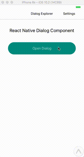
Try With Exponent
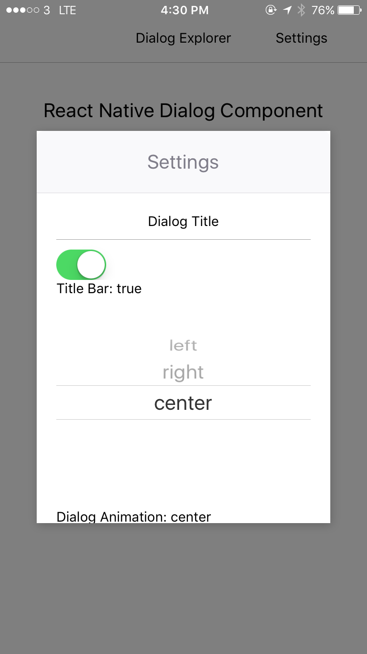
Installation
npm install --save react-native-dialog-component
# OR
yarn add react-native-dialog-component
Exposed Modules
- DialogManager
- DialogComponent
- Dialog
- DialogContent
- DialogButton
- DialogTitle
- Overlay
- Animation
- FadeAnimation
- ScaleAnimation
- SlideAnimation
Examples
Usage With DialogManager
import DialogManager, { ScaleAnimation, DialogContent } from 'react-native-dialog-component';
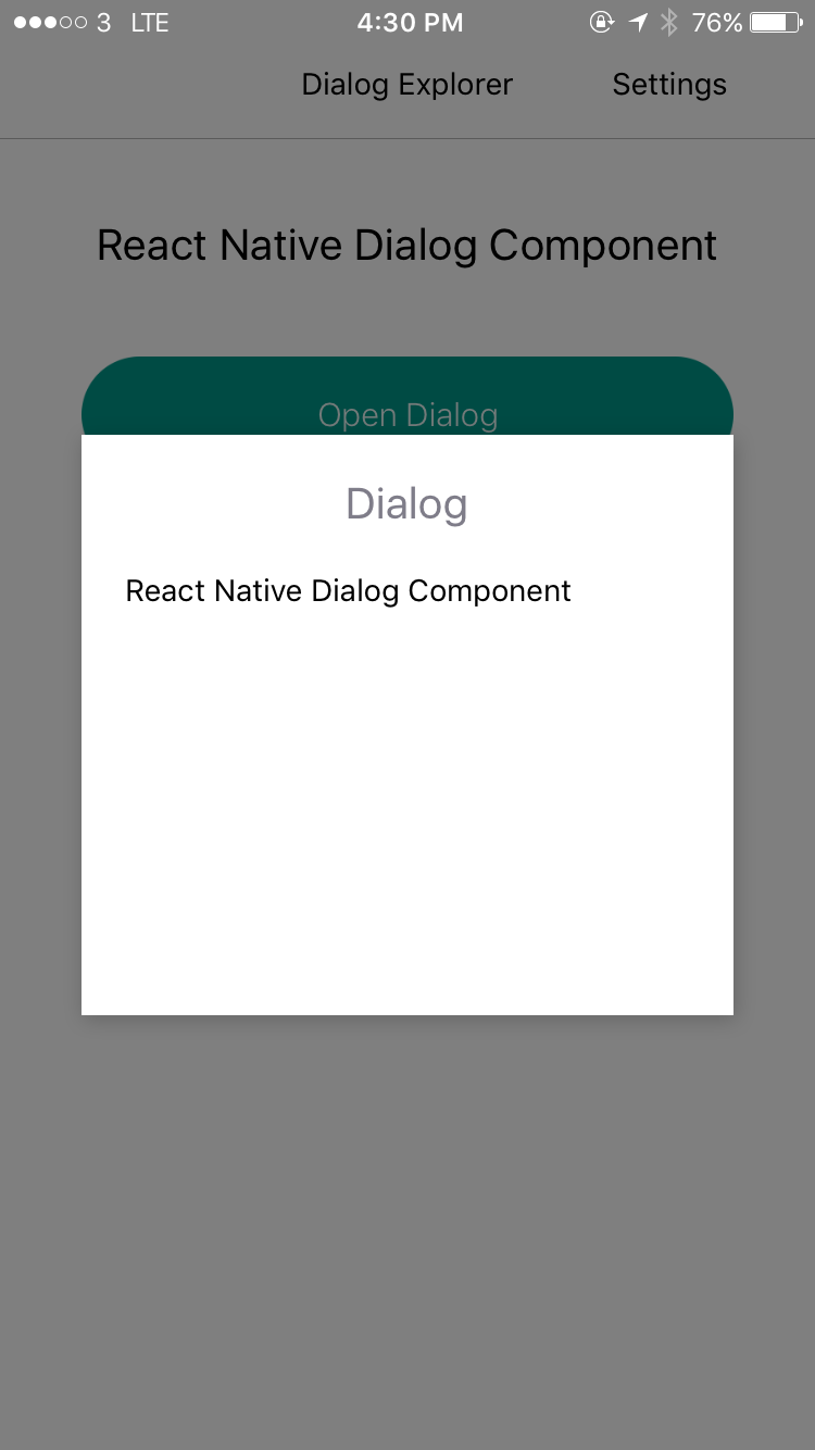
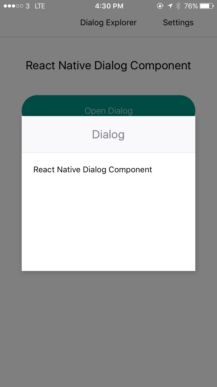
show
DialogManager.show({
  title: 'Dialog',
  titleAlign: 'center',
  animationDuration: 200,
  ScaleAnimation: new ScaleAnimation(),
  children: (
    <DialogContent>
      <View>
        <Text>
          React Native Dialog Component
        </Text>
      </View>
    </DialogContent>
  ),
}, () => {
  console.log('callback - show');
});
update
DialogManager.update({
  title: 'Dialog Updated',
  titleAlign: 'center',
  animationDuration: 200,
  ScaleAnimation: new ScaleAnimation(),
  children: (
    <DialogContent>
      <View>
        <Text>
          New Content
        </Text>
      </View>
    </DialogContent>
  ),
}, () => {
  console.log('callback - update dialog');
});
dismiss
// dismiss dialog
DialogManager.dismiss(() => {
  console.log('callback - dismiss');
});
dismiss all
DialogManager.dismissAll(() => {
  console.log('callback - dismiss all');
});
Usage with DialogComponent
import { DialogComponent }from 'react-native-dialog-component';

<View style={styles.container}>
  <Button
    text="Show Dialog"
    onPress={() => {
      this.dialogComponent.show();
    }}
  />
  <DialogComponent
    ref={(dialogComponent) => { this.dialogComponent = dialogComponent; }}
  >
    <View>
      <Text>Hello</Text>
    </View>
  </DialogComponent>
</View>
Usage - With Animation
import { DialogComponent, SlideAnimation } from 'react-native-dialog-component';

<View style={styles.container}>
  <Button
    text="Show Dialog"
    onPress={() => {
      this.dialogComponent.show();
    }}
  />
  <DialogComponent
    ref={(dialogComponent) => { this.dialogComponent = dialogComponent; }}
    dialogAnimation = { new SlideAnimation({ slideFrom: 'bottom' }) }
  >
    <View>
      <Text>Hello</Text>
    </View>
  </DialogComponent>
</View>
Usage - With Dialog Title
import { DialogComponent, DialogTitle } from 'react-native-dialog-component';

<View style={styles.container}>
  <Button
    text="Show Dialog"
    onPress={() => {
      this.dialogComponent.show();
    }}
  />
  <DialogComponent
    title={<DialogTitle title="Dialog Title" />}
    ref={(dialogComponent) => { this.dialogComponent = dialogComponent; }}
  >
    <View>
      <Text>Hello</Text>
    </View>
  </DialogComponent>
</View>
Usage - Wrape the content use DialogContent
import { DialogComponent, DialogTitle } from 'react-native-dialog-component';

<View style={styles.container}>
  <Button
    text="Show Dialog"
    onPress={() => {
      this.dialogComponent.show();
    }}
  />
  <DialogComponent
    dialogTitle={<DialogTitle title="Dialog Title" />}
    ref={(dialogComponent) => { this.dialogComponent = dialogComponent; }}
  >
    <DialogContent>
      <View>
        <Text>Hello</Text>
      </View>
    </DialogContent>
  </DialogComponent>
</View>
Props
DialogComponent
| Prop | Type | Default | Note |
|---|---|---|---|
title |
React Element |
You can pass a DialogTitle component or pass a View for customizing titlebar |
|
width |
Number |
Your device width | The Width of Dialog, you can use fixed width or use percentage |
height |
Number |
300 | The Width of Dialog, you can use fixed height or use percentage |
dialogAnimation |
FadeAnimation |
animation for dialog | |
dialogStyle |
Object or Number
|
||
animationDuration |
Number |
200 |
|
overlayPointerEvents |
String |
Available option: auto, none
|
|
overlayBackgroundColor |
String |
#000 |
|
overlayOpacity |
Number |
0.5 |
|
dismissOnTouchOutside |
Bool |
true |
When touch overlay will close dialog, but if haveOverlay is false then the dismissOnTouchOutside won't work |
dismissOnHardwareBackPress |
Bool |
true |
Only for Android |
haveOverlay |
Bool |
true |
If false won't show overlay when dialog show |
show |
Bool |
false |
|
onShown |
Function |
You can pass onShown function as a aallback function, will call the function while dialog shown | |
onDismissed |
Function |
You can pass onDismissed function as a callback function, will call the function while dialog dismissed | |
actions |
Array |
Array of DialogButton component for example: [<DialogButton text="DISMISS", align="center" onPress={this.dismissDialog}/>]
|
DialogContent
| Prop | Type | Default | Note |
|---|---|---|---|
contentStyle |
Dialog's content container |
DialogTitle
| Prop | Type | Default | Note |
|---|---|---|---|
title |
String |
||
titleStyle |
Object or Number
|
||
titleTextStyle |
Object or Number
|
||
titleAlign |
String |
center |
|
haveTitleBar |
Bool |
true |
DialogButton
| Prop | Type | Default | Note |
|---|---|---|---|
text |
String |
||
align |
String |
center |
The position of the button. Available option: left, center, right
|
onPress |
Function |
||
buttonStyle |
Object or Number
|
||
textStyle |
Object or Number
|
||
textContainerStyle |
Object or Number
|
||
disabled |
Boolean |
false |
|
activeOpacity |
Number |
Animation
Params for (*)Animation
FadeAnimation
| Param | Type | Default | Note |
|---|---|---|---|
toValue |
Number | 0 | |
animationDuration |
Number | 150 |
ScaleAnimation
| Param | Type | Default | Note |
|---|---|---|---|
toValue |
Number | 0 |
SlideAnimation
| Param | Type | Default | Note |
|---|---|---|---|
toValue |
Number | 0 | |
slideFrom |
String | bottom |
Available option: top, bottom, left, right
|
Note that the project description data, including the texts, logos, images, and/or trademarks,
for each open source project belongs to its rightful owner.
If you wish to add or remove any projects, please contact us at [email protected].