olets / Screenshotframes
Projects that are alternatives of or similar to Screenshotframes
ScreenshotFrames
v1.5.4
ScreenshotFrames is a small CSS library that lets you add browser and device frames around images (screenshots, for example) on an html page. All frames are fully responsive down to the narrowest standard smartphone width. And because every graphic element that resizes is either an svg (e.g. devices) or straight CSS (e.g. browser titlebar backgrounds and borders), the frames will always be crisp no matter how big or small you present them.
Use
Add the screenshot-frames.min.css stylesheet (or screenshot-frames-basics.min.css — see below), and then in the markup wrap the image with a screenshot frame class like
<div class="screenshot-framename">
	<img ... />
</div>
where "framename" is descriptive of the frame (e.g. .screenshot-ipad).
(Of course you can also use the unminified stylesheets, but really they're just included for Bower support.)
Restrictions
The .screenshot-framename must be 100% wide, can't have padding, and can't have any margins other than margin-bottom. Use a wrapping container to control width and margins as necessary.
Available Frames
screenshot-frames.min.css supports Chrome™, iPad Air®, iPhone®, Mac® monitor (Thunderbolt display), MacBook®, PC monitor (Dell™ Ultrasharp display), and Safari®.
If you don't need all that, consider using the lighter-weight screenshot-frames-basics.min.css, which only includes support for Safari, iPad, and iPhone.
You can also build your own custom set of frames (requires node): clone or download the repo, edit src/screenshot-frames-custom.less as necessary, and then in the ScreenshotFrames directory run
$ npm install
$ gulp build:custom
(Depending on your setup, you may need to do sudo npm install.) Your custom frame set will be saved as screenshot-frames-custom.min.css.
Browsers
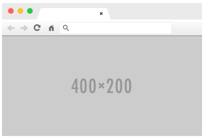
- Safari
use.screenshot-safari
image aspect ratio doesn't matter; container should be ≥ 310px wide

- Chrome
use.screenshot-chrome
image aspect ratio doesn't matter; container should be ≥ 220px wide
Supports the optionaldata-screenshoturlattribute. Usedata-screenshoturl="this://text.appearsinthe.addressbar"(see the demo pen for an example)
Desktop
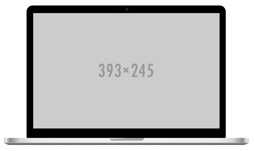
- MacBook
use.screenshot-macbook
takes image with aspect ratio 393:245 (see #1)
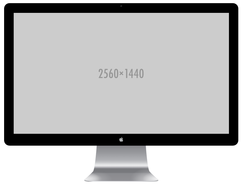
- Mac monitor (Thunderbolt display)
use.screenshot-mac
takes image with aspect ratio 16:9
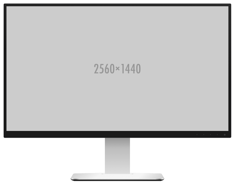
- PC monitor (Dell Ultrasharp display)
use.screenshot-pc
takes image with aspect ratio 16:9
Mobile
- iPad Air (silver)
use.screenshot-ipad
takes image with aspect ratio 3:4

- iPhone 6S (silver)
use.screenshot-iphone
takes image with aspect ratio 375:667

Roadmap
ChromeSafari-
iPad- w/ Mobile Safari
-
iPhone- w/ Mobile Safari
MacBookMac desktopPC desktop- some Android™
- w/ Chrome For Mobile
- Firefox®
- OS X® window
Contributing
Adding new frames is extremely easy, and PRs are welcome. For each new frame
-
add the stylesheet src/framename/screenshot-frame-framename.less
- for base64 encoded background images (cf. Safari frame), use
background-image: url(filepathrelativetostylesheet)(supports png and jpg) - for svg background images (cf. iPhone frame), use
background-image: url('data:image/svg+xml;utf8,/* svg \*//* endinject */') - for mobile and desktop frames, use svg; for browser frames, use whichever is lighter
- for base64 encoded background images (cf. Safari frame), use
-
add relevant images and/or svgs to src/framename
-
in src/screenshot-frames-additional.less and src/screenshot-frames-custom.less
- add the frame class where appropriate
- import the stylesheet
-
add a demo to demo/demo.html
-
if appropriate, credit the illustrator in the README.md's "Acknowledgments"
Compile with
$ gulp config
$ gulp build
Acknowledgments
- Chrome forked from Ed Williams's "Chrome Window for Sketch.app & Dribbble"
- iPad forked from DTAIL Studio's "The Ultimate Mobile Devices Pack" with colors from Facebook Design's "Apple iPad Air"
- iPhone forked from Philip Wong's "Free: Slate style iPhone 6 / 6+ mockup" with colors from Facebook Design's "Apple iPhone 6S"
- Mac desktop forked from Facebook Design's "Apple Thunderbolt Display"
- MacBook forked from Peter Hol's "Apple devices Sketch file"
- PC desktop forked from Facebook Design's "Dell Ultrasharp Monitor"
- Safari forked from Ed Piel's "Safari UI Template for Sketch"
Android and Chrome are trademarks of Google Inc.
Dell is a trademark of Dell Inc.
iPad, iPad Air, iPhone, Mac, MacBook, OS X, and Safari are registered trademarks of Apple, Inc.
Firefox is a registered trademark of the Mozilla Foundation.