SPStore / Spalertcontroller
Licence: mit
提醒对话框,风格和微信原生几乎零误差。简书地址:
Stars: ✭ 395
Labels
Projects that are alternatives of or similar to Spalertcontroller
Lihalert
Advance animated alerts for iOS written in Swift
Stars: ✭ 34 (-91.39%)
Mutual labels: alertview
Bpstatusbaralert
BPStatusBarAlert is a library that allows you to easily make text-based alert that appear on the status bar and below navigation bar.
Stars: ✭ 129 (-67.34%)
Mutual labels: alertview
BalloonPopup
Forget Android Toast! BalloonPopup displays a round or squared popup and attaches it to a View, like a callout. Uses the Builder pattern for maximum ease. The popup can automatically hide and can persist when the value is updated.
Stars: ✭ 32 (-91.9%)
Mutual labels: alertview
Cdalertview
Highly customizable alertview and alert/notification/success/error/alarm popup written in Swift
Stars: ✭ 1,056 (+167.34%)
Mutual labels: alertview
Customalertviewdialogue
Custom AlertView Dialogue is the world's most advanced alert view library. Custom AlertView Dialogue includes simple message popups, confirmation alerts, selector popups, action sheet bottom menus, and input/feedback contact forms.
Stars: ✭ 100 (-74.68%)
Mutual labels: alertview
AlertKit
🚨 SwiftUI alerts (and action sheets) done right
Stars: ✭ 60 (-84.81%)
Mutual labels: alertview
Alertonboarding
A simple and attractive AlertView to onboard your users in your amazing world.
Stars: ✭ 766 (+93.92%)
Mutual labels: alertview
Fwpopupview
弹窗控件:支持AlertView、Sheet、自定义视图的PopupView。AlertView中可以嵌套自定义视图,各组件的显示隐藏可配置;Sheet仿微信样式;同时提供自定义弹出。更多配置请参考”可设置参数“,提供OC使用Demo。
Stars: ✭ 361 (-8.61%)
Mutual labels: alertview
Kcustomalert
Simple and easy alerts to use instead of default AlertController. Separate Xib is provided to customize as pr your need. Callbacks are easily handled by using Closures.
Stars: ✭ 128 (-67.59%)
Mutual labels: alertview
ZbxWallboard
Wallboard with active triggers/problems of Zabbix Monitoring
Stars: ✭ 17 (-95.7%)
Mutual labels: alertview
Tyalertcontroller
Powerful, Easy to use alert view or popup view on controller and window, support blur effects,custom view and animation,for objective-c,support iphone, ipad
Stars: ✭ 1,290 (+226.58%)
Mutual labels: alertview
TezAlertView
Custom singleton alertView with block completion.
Stars: ✭ 17 (-95.7%)
Mutual labels: alertview
Lgalertview
Customizable implementation of UIAlertViewController, UIAlertView and UIActionSheet. All in one. You can customize every detail. Make AlertView of your dream! :)
Stars: ✭ 1,027 (+160%)
Mutual labels: alertview
Rnkit Alert View
React Native Alert View component for iOS + Android
Stars: ✭ 24 (-93.92%)
Mutual labels: alertview
Alertview
A library to create simple alerts easily with some customization.
Stars: ✭ 222 (-43.8%)
Mutual labels: alertview
Popupdialog
A simple, customizable popup dialog for iOS written in Swift. Replaces UIAlertController alert style.
Stars: ✭ 3,709 (+838.99%)
Mutual labels: alertview
Sclalertview
Beautiful animated Alert View. Written in Objective-C
Stars: ✭ 3,426 (+767.34%)
Mutual labels: alertview
LGApplications
个人小demo集合:①ActionSheet; ②PickerView; ③ScrollView嵌套; ④渐变文字Label; ⑤tableView实现单选;
Stars: ✭ 36 (-90.89%)
Mutual labels: alertview
重大更新:4.0.0版本适配深色模式
SPAlertController


目录
功能特点
- [x] 采用VFL布局,3.0版本开始,核心控件为UIStackView,风格与微信几乎零误差
- [x] 3.0版本开始,对话框头部新增图片设置
- [x] 3.0版本开始,action支持图片设置
- [x] 3.0版本开始,iOS11及其以上系统可单独设置指定action后的间距
- [x] 3.0版本开始,支持富文本
- [x] action的排列可灵活设置垂直排列和水平排列
- [x] 每个action的高度自适应
- [x] 支持旋转(横竖屏)
- [x] 可以自定义各种UIView
- [x] 支持对话框毛玻璃和背景蒙层毛玻璃
- [x] 全面适配iPhoneX,iPhoneXR,iPhoneXS,iPhoneXS MAX
- [x] 全面适配深色模式
CocoaPods
版本4.0.0
platform:ios,'9.0'
target 'MyApp' do
  pod 'SPAlertController', '~> 4.0.0'
end
使用示例
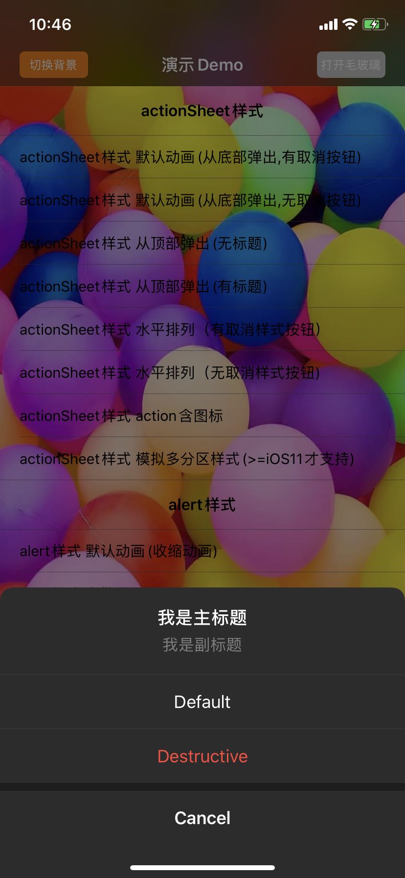
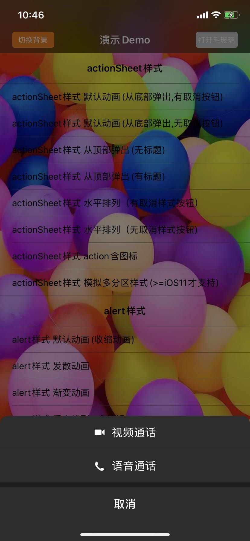
SPAlertController *alert = [SPAlertController alertControllerWithTitle:@"我是主标题" message:@"我是副标题" preferredStyle:SPAlertControllerStyleActionSheet];

SPAlertAction *action1 = [SPAlertAction actionWithTitle:@"Default" style:SPAlertActionStyleDefault handler:^(SPAlertAction * _Nonnull action) {}];
SPAlertAction *action2 = [SPAlertAction actionWithTitle:@"Destructive" style:SPAlertActionStyleDestructive handler:^(SPAlertAction * _Nonnull action) {}];
SPAlertAction *action3 = [SPAlertAction actionWithTitle:@"Cancel" style:SPAlertActionStyleCancel handler:^(SPAlertAction * _Nonnull action) {}];

[alert addAction:action1];
[alert addAction:action2];
[alert addAction:action3];
[self presentViewController: alert animated:YES completion:^{}];
API及属性详解
创建SPAlertController
+ (instancetype)alertControllerWithTitle:(nullable NSString *)title message:(nullable NSString *)message preferredStyle:(SPAlertControllerStyle)preferredStyle;
+ (instancetype)alertControllerWithTitle:(nullable NSString *)title message:(nullable NSString *)message preferredStyle:(SPAlertControllerStyle)preferredStyle animationType:(SPAlertAnimationType)animationType;
上面2种创建方式唯一的区别就是:第2种方式多了一个animationType参数,该参数可以设置弹出动画。如果以第一种方式创建,会采用默认动画,默认动画跟preferredStyle 有关,如果是SPAlertControllerStyleActionSheet样式,默认动画为从底部弹出,如果是SPAlertControllerStyleAlert样式,默认动画为从中间弹出
SPAlertController的头部配置
- title,对话框的主标题
- message,对话框的副标题
- attributedTitle,对话框的主标题,富文本
- attributedMessage,对话框的副标题,富文本
- image,对话框的头部上的图标,位置处于主标题之上
- titleColor,对话框主标题的颜色
- titleFont,对话框主标题的字体
- messageColor,对话框副标题的颜色
- messageFont,对话框副标题的字体
- textAlignment,对话框标题的对齐方式(标题指主标题和副标题)
- imageLimitSize,对话框头部图标的限制大小,默认是无穷大

SPAlertController的action配置
// 添加action,actions里面存放的就是添加的所有action

- (void)addAction:(SPAlertAction *)action;

@property (nonatomic, readonly) NSArray<SPAlertAction *> *actions;
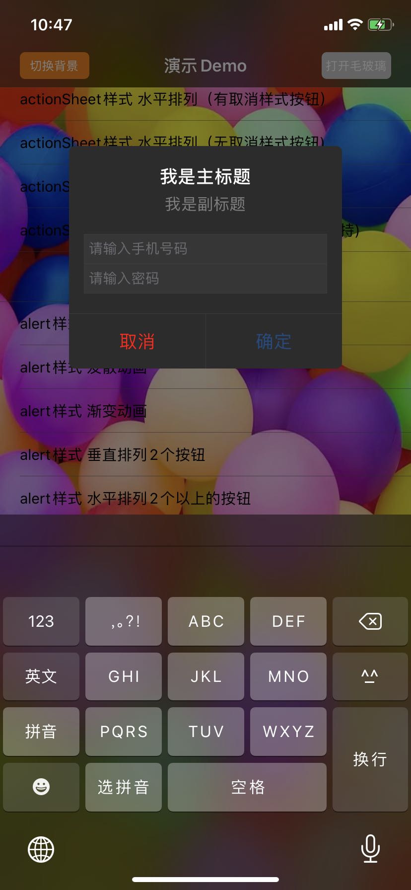
// 添加文本输入框,textFields存放的就是添加的所有textField

- (void)addTextFieldWithConfigurationHandler:(void (^ __nullable)(UITextField *textField))configurationHandler;

@property(nullable, nonatomic, readonly) NSArray<UITextField *> *textFields;

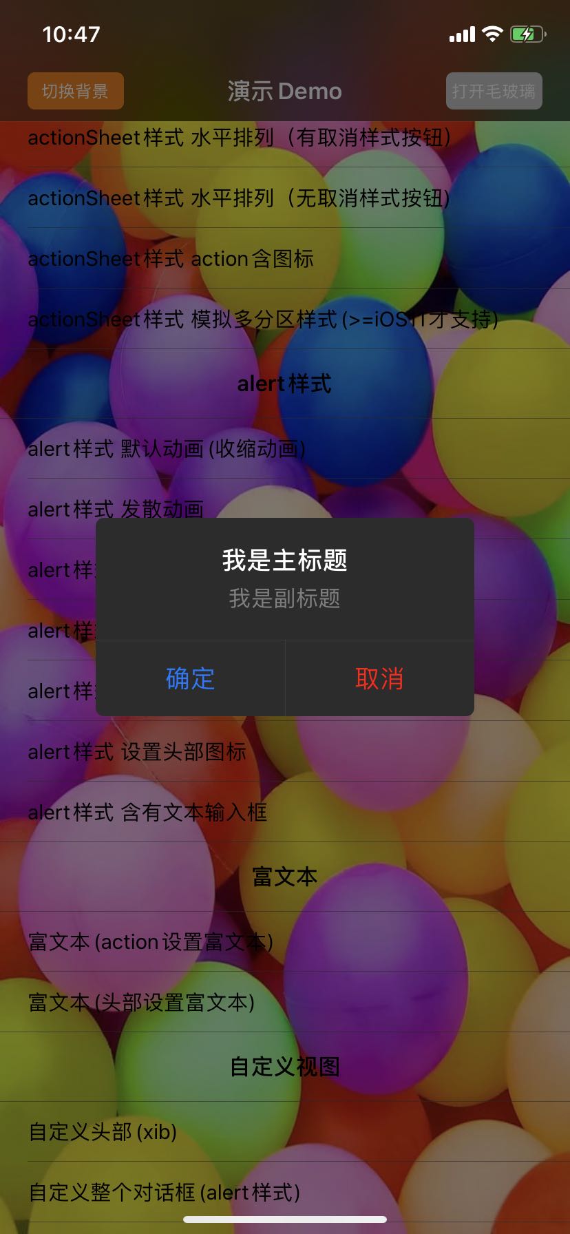
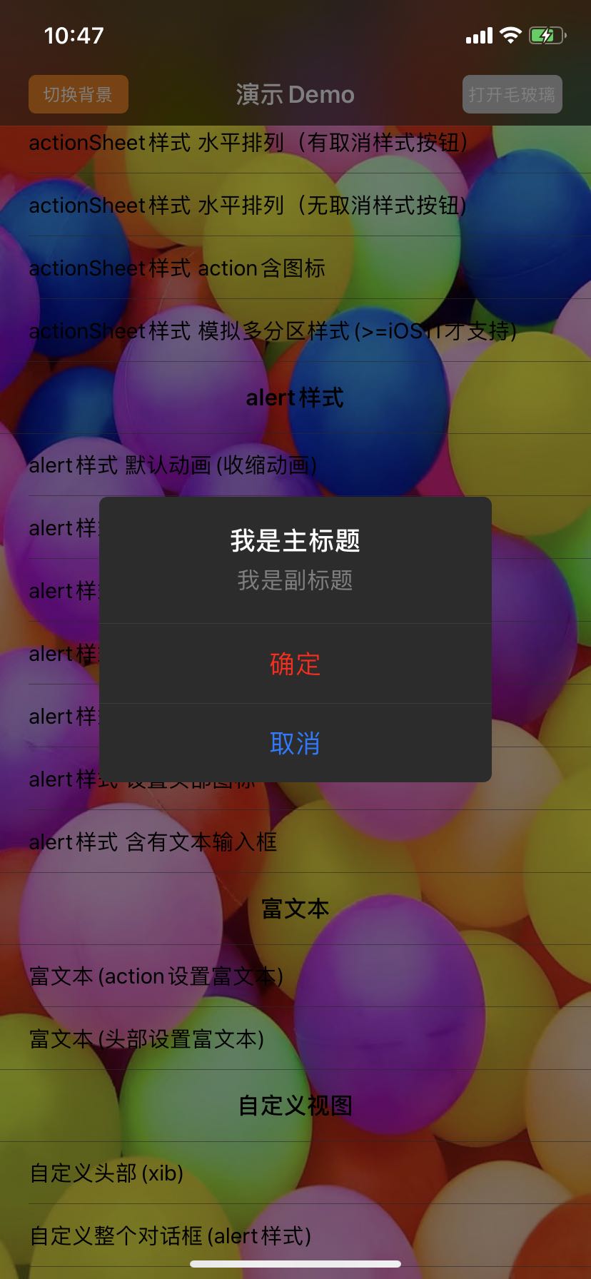
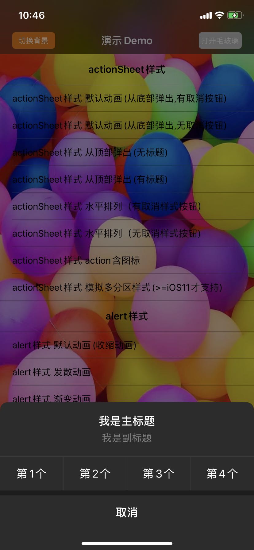
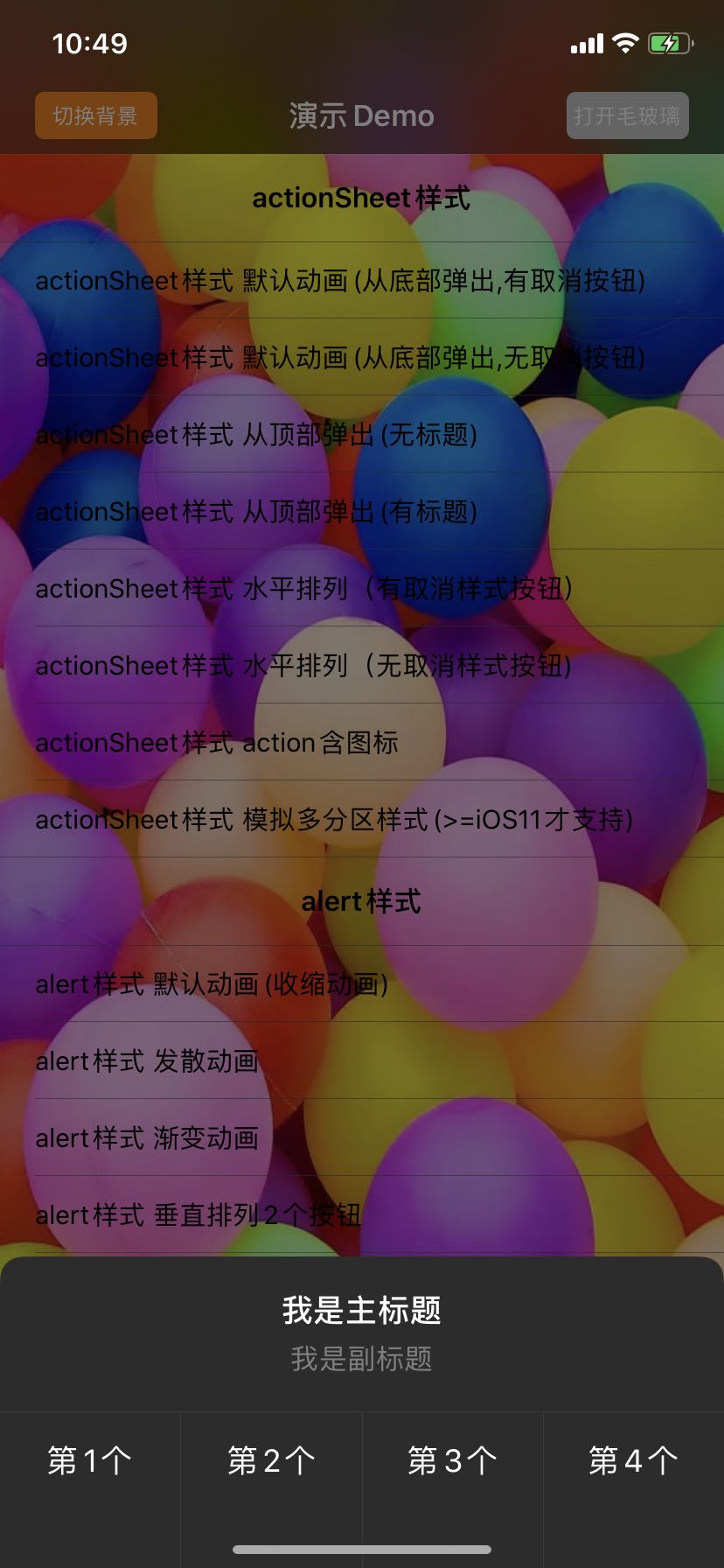
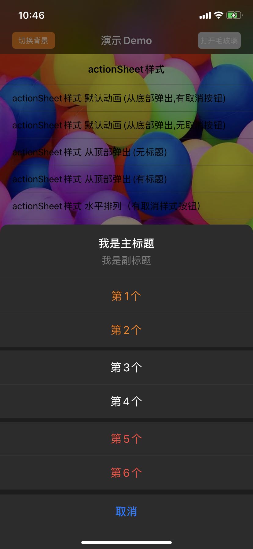
// SPAlertControllerStyleActionSheet样式下:默认为UILayoutConstraintAxisVertical(垂直排列), 如果设置为UILayoutConstraintAxisHorizontal(水平排列),则除去取消样式action之外的其余action将水平排列;SPAlertControllerStyleAlert样式下:当actions的个数大于2,或者某个action的title显示不全时为UILayoutConstraintAxisVertical(垂直排列),否则默认为UILayoutConstraintAxisHorizontal(水平排列),此样式下设置该属性可以修改所有action的排列方式;不论哪种样式,只要外界设置了该属性,永远以外界设置的优先

@property(nonatomic) UILayoutConstraintAxis actionAxis;
- SPAlertControllerStyleActionSheet样式下的垂直排列和水平排列

- SPAlertControllerStyleAlert样式下的垂直排列和水平排列

// 该属性配置的是距离屏幕边缘的最小间距;SPAlertControllerStyleAlert样式下该属性是指对话框四边与屏幕边缘之间的距离,此样式下默认值随设备变化,SPAlertControllerStyleActionSheet样式下是指弹出边的对立边与屏幕之间的距离,比如如果从右边弹出,那么该属性指的就是对话框左边与屏幕之间的距离,此样式下默认值为70

@property(nonatomic, assign) CGFloat minDistanceToEdges;
- 图中红色画线都是指minDistanceToEdges

// 该属性是制造对话框的毛玻璃效果,3.0版本开始采用的是系统私有类_UIDimmingKnockoutBackdropView所实现

@property(nonatomic, assign) BOOL needDialogBlur;
// SPAlertControllerStyleAlert下的偏移量配置 ,CGPoint类型,y值为正向下偏移,为负向上偏移;x值为正向右偏移,为负向左偏移,该属性只对SPAlertControllerStyleAlert样式有效,键盘的frame改变会自动偏移,如果外界手动设置偏移只会取手动设置的

@property(nonatomic, assign) CGPoint offsetForAlert;

- (void)setOffsetForAlert:(CGPoint)offsetForAlert animated:(BOOL)animated;
// 该API是设置和获取指定action后面的间距,如图中箭头所指,iOS11及其以上才支持

- (void)setCustomSpacing:(CGFloat)spacing afterAction:(SPAlertAction *)action API_AVAILABLE(ios(11.0));

- (CGFloat)customSpacingAfterAction:(SPAlertAction *)action API_AVAILABLE(ios(11.0));

 // 该API是设置背景蒙层的样式,分为半透明和毛玻璃效果,毛玻璃又细分为Dark,ExtraLight,Light3种样式

- (void)setBackgroundViewAppearanceStyle:(SPBackgroundViewAppearanceStyle)style alpha:(CGFloat)alpha;

  // 单击背景蒙层是否退出对话框,默认YES

@property(nonatomic, assign) BOOL tapBackgroundViewDismiss;
@property(nonatomic, assign) CGFloat cornerRadiusForAlert;
SPAlertControllerStyleAlert下的圆角半径
创建action
// 其中,title为action的标题,创建的时候仅支持普通文本,如果要使用富文本,可以另外设置action的属性attributedTitle,设置后会覆盖普通文本

+ (instancetype)actionWithTitle:(nullable NSString *)title style:(SPAlertActionStyle)style handler:(void (^ __nullable)(SPAlertAction *action))handler;
配置action
- title,action的标题
- attributedTitle,action的富文本标题,普通文本和富文本同时设置时,只会显示富文本
- image,action上的图片,文字和图片都存在时,图片在左,文字在右
- imageTitleSpacing,图片与文字之间的间距
- titleColor,action标题的颜色
- titleFont,action标题的字体
- titleEdgeInsets,action标题的内边距,此属性能够改变action的高度
- enabled,action是否能被点击

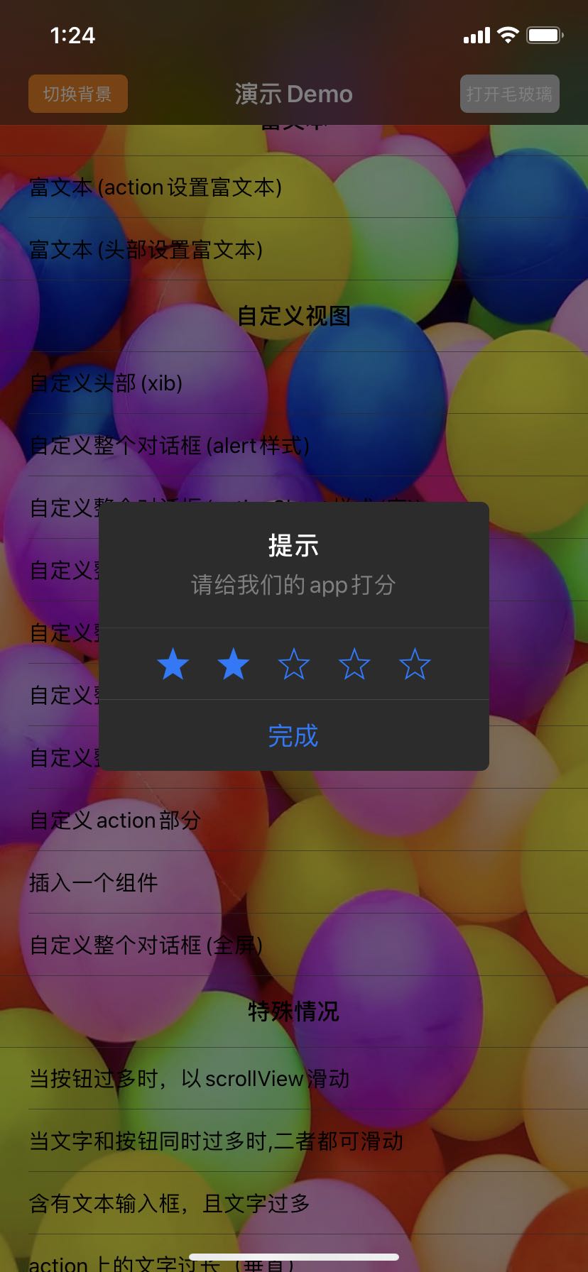
自定义View
- 自定义对话框的头部
+ (instancetype)alertControllerWithCustomHeaderView:(nullable UIView *)customHeaderView preferredStyle:(SPAlertControllerStyle)preferredStyle animationType:(SPAlertAnimationType)animationType;

- 自定义整个对话框
+ (instancetype)alertControllerWithCustomAlertView:(nullable UIView *)customAlertView preferredStyle:(SPAlertControllerStyle)preferredStyle animationType:(SPAlertAnimationType)animationType;

- 自定义对话框的action部分
+ (instancetype)alertControllerWithCustomActionSequenceView:(nullable UIView *)customActionSequenceView title:(nullable NSString *)title message:(nullable NSString *)message preferredStyle:(SPAlertControllerStyle)preferredStyle animationType:(SPAlertAnimationType)animationType;

关于自定义view的大小
- 非自动布局,在传入自定义view之前,应该为自定义的view设置好frame,也可以在传入自定义view之后,调用API
- (void)updateCustomViewSize:(CGSize)size设置其大小; - 自动布局,如果宽度和高度都能由子控件撑起来,那么你不需要设置frame,否则,宽度和高度只要有其中一个无法由子控件撑起,那么就必须设置其值,比如高度能被子控件撑起来,而宽度不能,那么你就必须手动设置一个宽度,高度可以不用设置或者设置为0都可。如果是xib或者storyboard,若自定义的view无法由子控件撑起来,SPAlertController会读取xib/storyboard中的默认frame,如果不合适,那么你应该修改xib/storyboard中的默认frame或者用纯代码重新设置frame。如果自定义view的宽度能够被子控件撑起,但同时又手动设置了自定义view的宽度,那么SPAlertController会取自动撑起的宽度和手动设置的宽度中较大的那个,高度同理。有一种情况要值得注意:如果子控件类似按钮这种不设置大小就自动会产生大小的子控件,同时该按钮设置了左右间距,那么它就能将自定义的view的宽度撑起,但是这种撑起来的宽度可能并非你想要的,因为按钮宽度是由内容自动产生,不是你设置的,这时你应该手动设置按钮的宽度,以便自定义的view的宽度被撑起的恰到好处,或者手动设置自定义view的宽度,这个手动设置的宽度,应该要比没有手动设置宽度的按钮将自定义view撑起来的宽度要大。
- 当自定义的view的大小在对话框显示期间发生了变化,你应该调用
- (void)updateCustomViewSize:(CGSize)size通知SPAlertController更新其大小
深色模式预览


历史版本
| 版本 | 更新日期 | 支持最低系统版本 | 更新内容 |
|---|---|---|---|
| v4.0.0 | 2020.04.27 | iOS9.0 | 适配深色模式 |
| v3.1.0 | 2019.08.08 | iOS9.0 | 1、actionSheet样式加了单边圆角效果 2、毛玻璃默认为NO 3、当不需要毛玻璃效果时,actionButton的选中背景色修改(灰度0.1),属于bug修复 4、“取消action”上的分割线背景色修改(灰度由0.3变为0.2),高度由6增加为8 5、每个actionButton的最小高度由49变为55 |
| v3.0.4 | 2019.06.03 | iOS9.0 | 修复了tapBackgroundViewDismiss属性无效问题 |
| v3.0.3 | 2019.05.30 | iOS9.0 | 修复了action点击的回调为nil时闪退问题 |
| v3.0.2 | 2019.05.09 | iOS9.0 | 修复了内存泄漏问题 |
| v3.0.1 | 2019.01.03 | iOS9.0 | 背景蒙层动画更加的柔和 |
| v3.0.0 | 2018.12.29 | iOS9.0 | 全方位的大重构 |
| v2.5.2 | 2018.12.03 | iOS8.0 | 1、按钮处于最底部时长按touchDown事件的延时现象采用新方式解决 2、修复了内存泄露问题 |
| v2.5.1 | 2018.11.07 | iOS8.0 | 1、修改了action的选中效果 2、解决iOS11之后,按钮处于最底部时长按touchDown事件的延时现象 |
| v2.5.0 | 2018.11.07 | iOS8.0 | 1、毛玻璃思路另辟蹊径,毛玻璃效果不会受到背景遮罩的影响,同时背景遮罩不再被镂空 2、增加动画枚举,可以从左右弹出 3、自定义view时的背景色改为透明色 4、增加actionHeight属性,修复maxNumberOfActionHorizontalArrangementForAlert属性 5、去除了中间tableView的最后一条分割线 6、修改了分割线的颜色,更加接近微信原生 7、修复centerView上有textView/textField,旋转屏幕后不可见问题 8、优化代码 |
| v2.1.1 | 2018.11.01 | iOS8.0 | |
| v2.1.0 | 2018.10.18 | iOS8.0 | |
| v2.0.0 | 2017.11.19 | iOS8.0 | |
| v1.7.0 | 2017.11.06 | iOS8.0 | |
| v1.5.0 | 2017.11.06 | iOS8.0 | |
| v1.0.1 | 2017.10.24 | iOS8.0 | |
| v1.0.0 | 2017.10.24 | iOS8.0 |
Note that the project description data, including the texts, logos, images, and/or trademarks,
for each open source project belongs to its rightful owner.
If you wish to add or remove any projects, please contact us at [email protected].