sruda / Steroidesign
Projects that are alternatives of or similar to Steroidesign

Make your projects look as good 💎 as the big ones 💪🏻
🚀 Join to the Steroidesign Weekly newsletter! 🚀
We'll submit a new theme every week (we know it's crazy, but it's not impossible 😵).
Show us your interest by signing up, so we'll know that there are people interested in this.
Made with ❤ & ☕ by @rosa7082 & @seruda in Portland, OR .
Problem
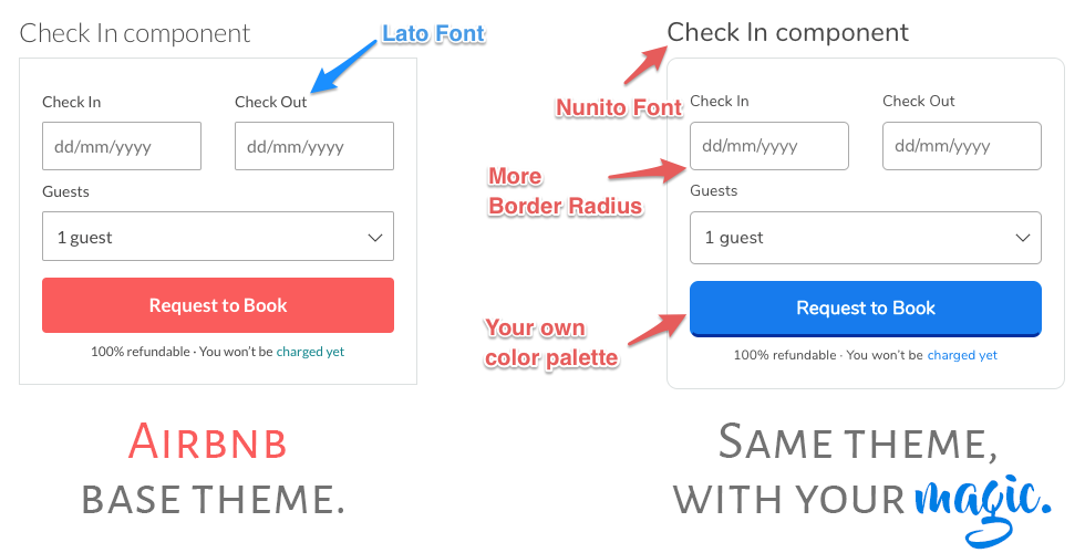
Whenever we start a new project, we spend a lot of time looking for inspiration on hundreds of websites, we take a little of each, and so we build our beloved Frankenstein 🤖. Our most important references are the most well-known Startups (Airbnb, Medium, Product Hunt, etc) as they have invested a lot of time in analyzing the best practices of design, validation of ideas, calls to action, hook, etc. And over time have been creating standards and trends.
Solution
Since many are looking for these sites, we decided to create a skeleton of HTML styles and components based on these big companies, themes that are 100% editable and adaptable to your own palette color or styles, adding your own magic 🔮!. So that your product remains authentic and unique.
With this, we do not seek to copy the big companies, but to obtain inspiration and have its base for our own projects.
The themes include the basic elements in a website: buttons, labels, links, typography, form elements, box components, search bar, navbars, etc, etc, etc.
Contributions are more than welcome.
Contents
- Base Methodology
- Installation and use
-
Themes
- Airbnb (Done v.1.0.0)
- Medium (In Progress)
- Product Hunt (Coming soon)
- Asana (Coming soon)
- Suggest us the next one
- License
Base methodology
For our own components, follow the BEM (Block, Element, Modifier) method for writing & organising CSS. BEM helps keep our CSS logical and predictable. The naming convention follows this pattern:
.block {}
.block__element {}
.block__element--modifier {}
-
.blockrepresents the higher level of an abstraction or component. -
.block__elementrepresents a descendent of .block that helps form .block as a whole. -
.block--modifierrepresents a different state or version of .block.
more references:
Installation and use
Install
Really you don´t need an 'installation', you just could clone the project, take the 'theme' folder and you are able to start. The only tools that you need to use these themes are:
- Sass
- Boostrap v3.3.7 (to keep row and column structure, but you can feel free to use another library for that, the only issue is that you could see the components examples in index HTML a little bit wrong, because we use bootstrap to arrange each component inside row and column grids).
If you want to run the demo page, you should follow this steps:
1: Install NodeJS v6 or latest (Not sure if there is any problem with previous versions, but this is the one we use).
2: On terminal (inside root directory) run the following commands:
- Clone the project.
git clone https://github.com/sergioruizdavila/startups-themes.git projectname
- Install gulp, bower and express components:
npm install
- Install basic components such as boostrap, jquery, animate.css:
bower install
- Launch a local server in order to see styles guideline:
gulp start
3: Open your favorite browser, and browse to:
There you can see whole styles guidelinein in a demo page.
How to use?
It's very simple, you have to copy the theme folder into your own project, inside you will find all styles organized by components, and a folder named core which contains all global styles and variables (e.g. main palette, helper classes, font family, etc.).
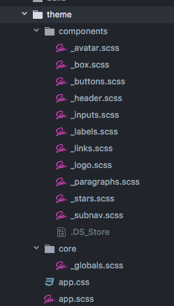
The file structure is:
-
components: A folder containing all styles of each component (buttons, links, forms, paragraphs, inputs, etc.)
-
core: Here are all the base styles of your project, here you find a file named _global.scss which contains all the global variables, helper classes, and base classes to reset the styles of some global elements such as the body, H tags, labels, etc.
-
app.scss: This is the parent file which contains a reference to all other styles:
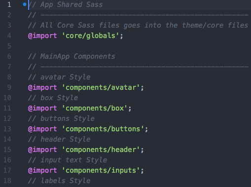
- app.min.css: It's the final result after running a small task in Gulp, compile it, concatenates and minifies every style in a single file. This is the file you should add in the < head > html section.
<! your vendors >
<link rel="stylesheet" href="/build/css/vendor.min.css">

<! theme styles >
<link rel="stylesheet" href="/theme/app.css">
- app.css: If you don't use Sass or another preprocessor, don't worry you can take this file and include it into your own project, and you could use any of the components freely.
You can also see examples of all components on index.html. You will see all the components organized by groups, you can simply take the component you need, and take it to your own project.
Any questions please write us: @rosa7082 & @seruda
Enjoy it!
Themes
Airbnb
Status: See components (v1.0.0)
We used this theme in other own project: http://www.waysily.com

Medium
Status: In Progress
Product Hunt
Status: Coming soon
Asana
Status: Coming soon
Suggest us the next one
We started working on the themes that we believe would be the most beautiful and complete. But if you want us to start in a more great one, just let us know: @rosa7082 & @seruda, or by email: Rosita & Sergio. You can write us if you'd like to talk to us.
License

Important: Themes are not a copy, we write styles and structure from scratch, based on our own file structure and our own way of organizing styles (based n the BEM methodology), what we want with this is to create a 'skeleton' that can be used, edited, modified and replaced in any project.
We are not responsible for misinterpretation or inappropriate use of this content and information. In the same way, we will not be responsible for the damages caused directly or indirectly by the using of this material. In no way are we liable for the consequences of the improper or negligent use of this material.