ra1028 / Carbon
Programming Languages
Projects that are alternatives of or similar to Carbon
A declarative library for building component-based user interfaces in UITableView and UICollectionView.
| Declarative | Component-Based | Non-Destructive |
|---|---|---|
| Provides a declarative design with power of diffing algorithm for building list UIs. | Declare component once, it can be reused regardless kind of the list element. | Solves the various problems by architecture and algorithm without destructing UIKit. |


Introduction
Carbon is a library for building component-based user interfaces in UITableView and UICollectionView inspired by SwiftUI and React.
This make it painless to build and maintain the complex UIs.
Since components made with Carbon can be works directly on SwiftUI, the cost of future migration can be greatly reduced.
Uses DifferenceKit which is highly optimized based on Paul Heckel's paper for diffing.
Declarative design and diffing algorithm make your code more predictable, debugging easier and providing beautiful animations to users.
Our goal is similar to Instagram/IGListKit and airbnb/Epoxy, we respect those library as pioneers.
Examples
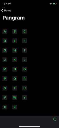 |
 |
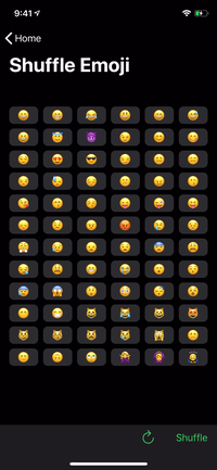 |
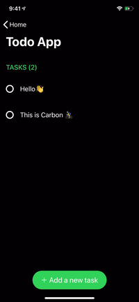 |
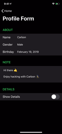 |
|---|

renderer.render {
    Header("GREET")
        .identified(by: \.title)

    HelloMessage("Vincent")
    HelloMessage("Jules")
    HelloMessage("Mia")

    Footer("👋 Greeting from Carbon")
        .identified(by: \.text)
}
SwiftUI Compatibility
struct ContentView: View {
    var body: some View {
        ScrollView {
            VStack {
                Text("GREET")
                    .font(.title)
                    .padding(.horizontal, 16)

                HelloMessage("World")
                    .frame(height: 60)
                    .background(Color.red)
            }
        }
    }
}
Getting Started
Build for Development
$ git clone https://github.com/ra1028/Carbon.git
$ cd Carbon/
$ make setup
$ open Carbon.xcworkspace
Basic Usage
Described here are the fundamentals for building list UIs with Carbon.
The API document will help you understand the details of each type.
For more advanced usage, see the Advanced Guide.
And the more practical examples are here.
Component
Component is the base unit of the UI in Carbon.
All elements are made up of components, and it can be animated by diffing update.
UIView, UIViewController and its subclasses are available as content of component by default.
You can declare fixed size component by implementing referenceSize(in bounds: CGRect) -> CGSize?. The default is to return nil and falls back to a value such as UITableView.rowHeight or UICollectionViewFlowLayout.itemSize.
See here for more depth of component.
Definition below is the simplest implementation.
struct HelloMessage: Component {
    var name: String

    func renderContent() -> UILabel {
        UILabel()
    }

    func render(in content: UILabel) {
        content.text = "Hello \(name)"
    }
}
Component used as a cell requires to specify an arbitrary id.
Give an id by Component.identified(by:) or declare it by using IdentifiableComponent protocol.
Renderer
The components are displayed on the list UI by Renderer.render.
Boilerplates such as registering element types to a table view are no longer needed in Carbon.
The adapter acts as delegate and dataSource, the updater handles updates.
You can also change the behaviors by inheriting and customizing it.
There are also UITableViewReloadDataUpdater and UICollectionViewReloadDataUpdater which update by reloadData without diffing updates.
When render called again, the updater calculates the diff from the currently rendered components and updates them with the system animation.
Renderer for UITableView:
@IBOutlet var tableView: UITableView!

let renderer = Renderer(
    adapter: UITableViewAdapter(),
    updater: UITableViewUpdater()
)

override func viewDidLoad() {
    super.viewDidLoad()

    renderer.target = tableView
}
Renderer for UICollectionView:
@IBOutlet var collectionView: UICollectionView!

let renderer = Renderer(
    adapter: UICollectionViewFlowLayoutAdapter(),
    updater: UICollectionViewUpdater()
)

override func viewDidLoad() {
    super.viewDidLoad()

    renderer.target = collectionView
}
Render Components:
renderer.render {
    Header("GREET")
        .identified(by: \.title)

    HelloMessage("Butch")
    HelloMessage("Fabianne")
}
Section
A section can include header, footer and cells.
This also needs to specify id for identify from among multiple sections.
The cells can be declared using a function builder as below:
let appearsBottomSection: Bool = ...
let appearsFourthMan: Bool = ...

renderer.render {
    Section(
        id: "Bottom",
        header: Header("GREET"),
        footer: Footer("👋 Greeting from Carbon"),
        cells: {
            HelloMessage("Marsellus")
            HelloMessage("The Wolf")
        }
    )

    if appearsBottomSection {
        Section(id: "Top") {
            HelloMessage("Brett")
            HelloMessage("Roger")

            if appearsFourthMan {
                HelloMessage("Fourth Man")
            }
        }
    }
}
Group
The number of limit to declare cells or section with function builder syntax is until 10. You can avoid that limitation by grouping with Group.
It can also be used to create a cell or section from an array with N elements.
Group of Components:
renderer.render {
    Group {
        Header("GREET")
            .identified(by: \.title)

        HelloMessage("Vincent")
        HelloMessage("Jules")
    }

    Group(of: ["Pumpkin", "Honey Bunny"]) { name in
        HelloMessage(name)
    }
}
Group of Sections:
renderer.render {
    Group {
        Section(id: 0) {
            HelloMessage("Jimmie")
        }

        Section(id: 1) {
            HelloMessage("Bonnie")
        }
    }

    Group(of: ["Lance", "Jody"]) { name in
        Section(id: name) {
            HelloMessage(name)
        }
    }
}
[See More Usage] [See Example App]
Advanced Guide
Custom Content
Of course, the content of component can use custom class. You can also instantiate it from Xib.
It can be inherited whichever class, but the common means is inherit UIView or UIViewController.
class HelloMessageContent: UIView {
    @IBOutlet var label: UILabel!
}
struct HelloMessage: Component {
    var name: String

    func renderContent() -> HelloMessageContent {
        HelloMessageContent.loadFromNib()  // Extension for instantiate from Xib. Not in Carbon.
    }

    func render(in content: HelloMessageContent) {
        content.label.text = "Hello \(name)"
    }
}
IdentifiableComponent
IdentifiableComponent is a component that simply can predefine an identifier.
It can be omitted the definition of id if the component conforms to Hashable.
struct HelloMessage: IdentifiableComponent {
    var name: String

    var id: String {
        name
    }

    ...
SwiftUI Compatibility
Components made with Carbon are compatible with SwiftUI.
The component can easily works as SwiftUI by composing with View protocol.
Currently SwiftUI doesn't support self-sizing, so can use UIView.intrinsicContentSize or specify the height explicitly by Component.referenceSize(in:) or View.frame(height:).
struct HelloMessage: Component, View {
    ...
}
struct ContentView: View {
    var body: some View {
        VStack(alignment: .leading) {
            Text("GREET")

            HelloMessage("World")
                .frame(height: 60)

            Spacer()
        }
    }
}
Component in-Depth
Components can define more detailed behaviors.
Following are part of it.
-
shouldContentUpdate(with next: Self) -> Bool
If the result istrue, the component displayed as a cell is reloaded individually, header or footer is reloaded with entire section.
By default it returnsfalse, but the updater will always re-render visible components changed. -
referenceSize(in bounds: CGRect) -> CGSize?
Defining the size of component on the list UI.
You can use default value such asUITableView.rowHeightorUICollectionViewLayout.itemSizeby returningnil.
Returnsnilby default. -
shouldRender(next: Self, in content: Content) -> Bool
By returningfalse, you can skip component re-rendering when reloading or dequeuing element.
Instead of re-rendering, detects component changes by comparing with next value.
This is recommended to use only for performance tuning. -
contentWillDisplay(_ content: Content)
Invoked every time of before a component got into visible area. -
contentDidEndDisplay(_ content: Content)
Invoked every time of after a component went out from visible area.
Selection
Cell selection can be handled by setting didSelect to the instance of UITableViewAdapter or UICollectionViewAdapter.
renderer.adapter.didSelect { context in
    print(context)
}
However, we recommend to make the Content of the component to the class inherited from UIControl.
It's more maintainable and extensible.
class MenuItemContent: UIControl {
    @IBOutlet var label: UILabel!

    var onSelect: (() -> Void)?

    @objc func handleSelect() {
        onSelect?()
    }

    override func awakeFromNib() {
        super.awakeFromNib()
        addTarget(self, action: #selector(handleSelect), for: .touchUpInside)
    }
}
struct MenuItem: Component {
    var text: String
    var onSelect: () -> Void

    func renderContent() -> MenuItemContent {
        MenuItemContent.loadFromNib()
    }

    func render(in content: MenuItemContent) {
        content.label.text = text
        content.onSelect = onSelect
    }
}
In this way, in order to cancel the selection by scrolling, you need to implement the following extension.
extension UITableView {
    open override func touchesShouldCancel(in view: UIView) -> Bool {
        true
    }
}

extension UICollectionView {
    open override func touchesShouldCancel(in view: UIView) -> Bool {
        true
    }
}
Adapter Customization
You can add methods of delegate, dataSource by subclassing each adapter.
class CustomTableViewdapter: UITableViewAdapter {
    func tableView(_ tableView: UITableView, titleForHeaderInSection section: Int) -> String? {
        "Header title for section\(section)"
    }
}

let renderer = Renderer(
    adapter: CustomTableViewAdapter(),
    updater: UITableViewUpdater()
)
Furthermore, it can be customized the class of the elements(cell/header/footer) which becomes the container of components by overriding some methods in adapter as following.
You can also use xib by giving nib as parameter of init of the return value Registration.
class CustomTableViewAdapter: UITableViewAdapter {
    // Use custom cell.
    override func cellRegistration(tableView: UITableView, indexPath: IndexPath, node: CellNode) -> CellRegistration {
        CellRegistration(class: CustomTableViewCell.self)
    }

    // Use custom header view.
    override func headerViewRegistration(tableView: UITableView, section: Int, node: ViewNode) -> ViewRegistration {
        ViewRegistration(class: CustomTableViewHeaderFooterView.self)
    }

    // Use custom footer view.
    override func footerViewRegistration(tableView: UITableView, section: Int, node: ViewNode) -> ViewRegistration {
        ViewRegistration(class: CustomTableViewHeaderFooterView.self)
    }
}
In UICollectionViewAdapter, you can select the node corresponding to a certain kind.
class CustomCollectionViewAdapter: UICollectionViewAdapter {
    override func supplementaryViewNode(forElementKind kind: String, collectionView: UICollectionView, at indexPath: IndexPath) -> ViewNode? {
        switch kind {
        case "CustomSupplementaryViewKindSectionHeader":
            return headerNode(in: indexPath.section)

        default:
            return super.supplementaryViewNode(forElementKind: kind, collectionView: collectionView, at: indexPath)
        }
    }
}
Updater Customization
It can be modify the updating behavior of the list UI by inheriting Updater.
This is important thing to make Carbon well adapted to your project.
Below are some of the default provided settings of updater.
-
isAnimationEnabled
Indicating whether enables animation for diffing updates, settingfalsewill perform it usingUIView.performWithoutAnimation.
Default istrue. -
isAnimationEnabledWhileScrolling
Indicating whether enables animation for diffing updates while target is scrolling, settingfalsewill perform it usingUIView.performWithoutAnimation.
Default isfalse. -
animatableChangeCount
The max number of changes to perform diffing updates. It falls back toreloadDataif it exceeded.
Default is300. -
keepsContentOffset
Indicating whether that to reset content offset after updated.
The content offset become unintended position after diffing updates in some case. If settrue, revert content offset after updates.
Default istrue.
Without FunctionBuilder Syntax
Carbon can also build a UI with declarative syntax without function builder as following.
- ViewNode
This is a node representing header or footer. The node is wrap an instance of type conforming to Component protocol.
ViewNode(Header("GREET"))
- CellNode
CellNode is a node representing cell.
Unlike in the ViewNode, this needs an id which Hashable type to identify from among a lot of cells.
The id is used to find the same component in the list data before and after changed.
CellNode(id: 0, HelloMessage("Jules"))
CellNode(HelloMessage("Jules").identified(by: \.name))
CellNode(HelloMessage("Jules"))  // Using `IdentifiableComponent`.
- Section and render
renderer.render(
    Section(
        id: "Section",
        header: ViewNode(Header("GREET")),
        cells: [
            CellNode(HelloMessage("Vincent")),
            CellNode(HelloMessage("Mia")),
            CellNode(HelloMessage("Jules"))
        ],
        footer: ViewNode(Footer("👋 Greeting from Carbon"))
    )
)
Requirements
- Swift 5.1+
- Xcode 11.0+
Installation
CocoaPods
Add the following to your Podfile:
pod 'Carbon'
Carthage
Add the following to your Cartfile:
github "ra1028/Carbon"
Swift Package Manager
Select Xcode menu File > Swift Packages > Add Package Dependency... and enter repository URL with GUI.
Repository: https://github.com/ra1028/Carbon
Contributing
Pull requests, bug reports and feature requests are welcome 🚀
Please see the CONTRIBUTING file for learn how to contribute to Carbon.
Respect
Libraries for list UIs using diffing algorithm that I have sincerely ❤️ and respected.
-
React (by Facebook)
I have very inspired about paradigm and API design. -
IGListKit (by Instagram)
The most popular library among list UI libraries using diffing algorithm in iOS. -
Epoxy (by Airbnb)
The most popular library among list UI libraries using diffing algorithm in Android. -
RxDataSources (by @kzaher, RxSwift Community)
A great library that can complex diffing update by very fast algorithms. -
Texture (by TextureGroup, Facebook, Pinterest)
The one and only library for creating list UIs that pursues rendering performance. -
Bento (by Babylon Health)
Bento is an awesome declarative library that has an API design which follows React. -
ReactiveLists (by PlanGrid)
Uses DifferenceKit as well as Carbon for the diffing algorithm.
License
Carbon is released under the Apache 2.0 License.