electricityMap


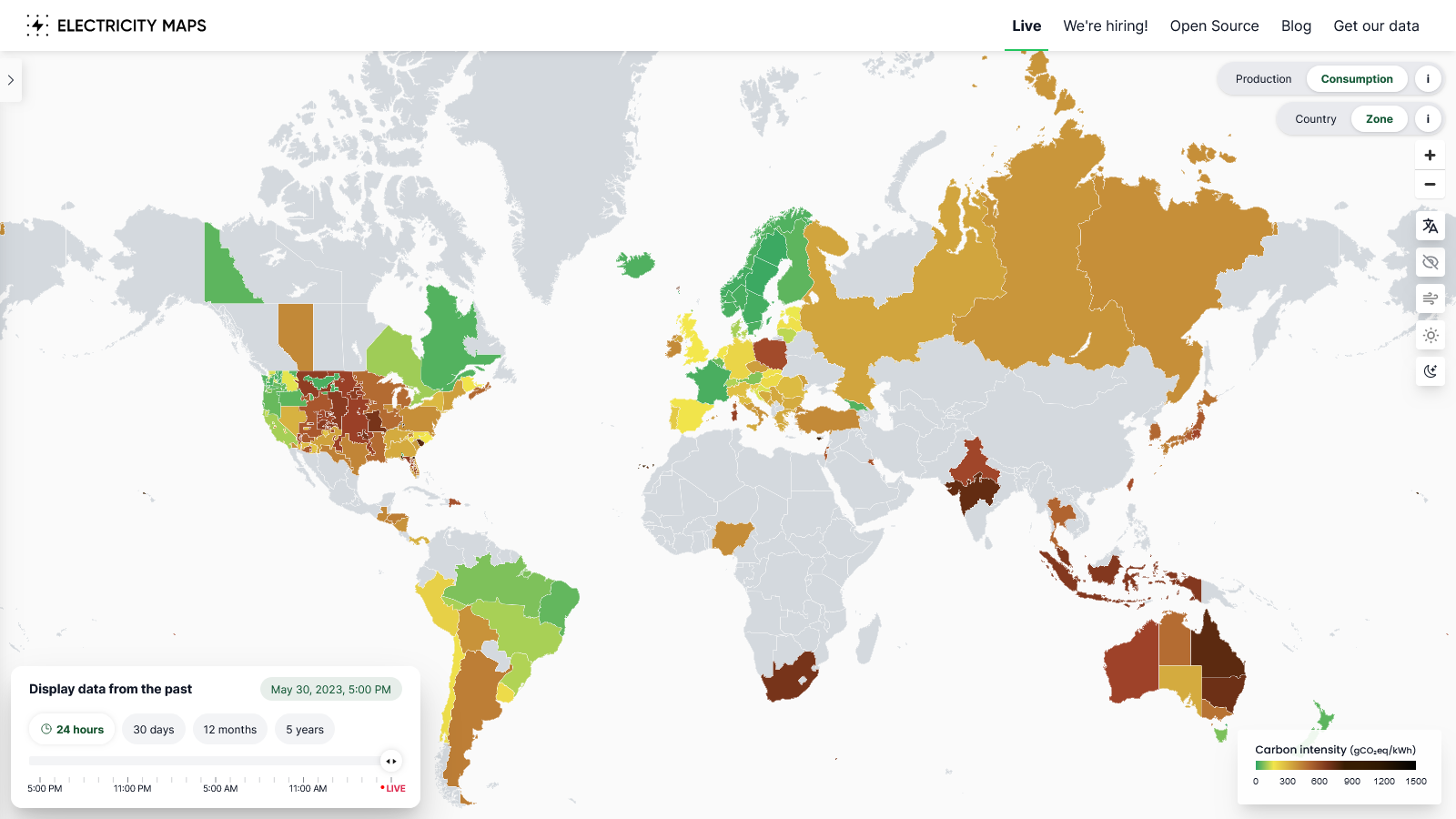
A real-time visualisation of the Greenhouse Gas (in terms of CO2 equivalent) footprint of electricity consumption built with d3.js and mapbox GL, maintained by Tomorrow. Try it out at http://app.electricitymap.org, or download the app on Google Play or App store.
Contribute
Thank you for your interest. Check out the Wiki for how to get started. Also, have a look at our current issues and discussions
Here are some of the ways you can contribute:
- Building a new parser
- Fixing a broken parser
- Changes to the frontend
- Find data sources
- Verify data sources
- Translating the app
- Updating region capacities
Join us on Slack if you wish to discuss development or need help to get started.
We would love your feedback on how to improve the contribution experience, please feel free to fill out this form
Frequently asked questions
Where does the data come from? The data comes from many different sources. You can check them out here
How do you define real-time data? Real-time data is defined as a data source with an hourly (or better) frequency, delayed by less than 2hrs. It should provide a breakdown by generation type. Often fossil fuel generation (coal/gas/oil) is combined under a single heading like 'thermal' or 'conventional', this is not a problem.
Why do you calculate the carbon intensity of consumption? In short, citizens should not be responsible for the emissions associated with all the products they export, but only for what they consume. Consumption-based accounting (CBA) is a very important aspect of climate policy and allows assigning responsibility to consumers instead of producers. Furthermore, this method is robust to governments relocating dirty production to neighboring countries in order to green their image while still importing from it. You can read more in our blog post here.
Why don't you show emissions per capita? A country that has few inhabitants but a lot of factories will appear high on CO2/capita. This means you can "trick" the numbers by moving your factory abroad and import the produced good instead of the electricity itself. That country now has a low CO2/capita number because we only count CO2 for electricity (not for imported/exported goods). The CO2/capita metric, by involving the size of the population, and by not integrating all CO2 emission sources, is thus an incomplete metric. CO2 intensity on the other hand only describes where is the best place to put that factory (and when it is best to use electricity), enabling proper decisions.
CO2 emission factors look high — what do they cover exactly? The carbon intensity of each type of power plant takes into account emissions arising from the whole life cycle of the plant (construction, fuel production, operational emissions and decommissioning).
Is delayed data useful? While the map relies on having real-time data to work it's still useful to collect data from days/months past. This older data can be used to show past emissions and build up a better dataset. So if there's an hourly data source that lags several days behind you can still build a parser for it.
Can scheduled/assumed generation data be used? The electricityMap doesn't use scheduled generation data or make assumptions about unknown fuel mixes. This is to avoid introducing extra uncertainty into emissions calculations.
Can areas other than countries be shown? Yes, providing there is a valid GeoJSON geometry (or another format that can be converted) for the area. As an example, we already split several countries into states and grid regions.
How can I get access to historical data or the live API? All this and more can be found here.