angular-slider / Ngx Slider
Programming Languages
Projects that are alternatives of or similar to Ngx Slider
ngx-slider

Website: https://angular-slider.github.io/ngx-slider/
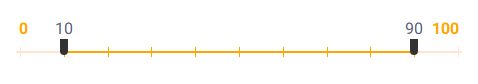
Self-contained, mobile friendly slider component for Angular 6+ based on angularjs-slider.
NOTE: This component used to be known as ng5-slider before the v2.0.0 release. Starting with v2.0.0, it has been re-branded as ngx-slider, targeting Angular 6+. If you have been using the previous version in your app, please follow the instructions in UPGRADING.md. If you are sticking with the old version, it will continue to be available in the v1.2.x release line under the old name of ng5-slider. If you are looking for documentation for the old version, it is available as archived copy on Github.
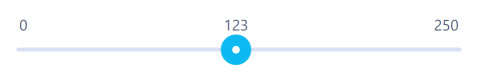
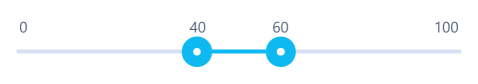
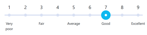
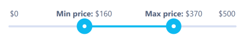
Demos
-
Single slider - StackBlitz
-
Range slider - StackBlitz
-
Slider with ticks - StackBlitz
-
Customised slider - StackBlitz
-
Slider with custom style - StackBlitz
-
Vertical slider - StackBlitz

Dependencies
- Angular 6+
- rxjs 6+
Installation
To add the slider to your Angular project:
npm install --save @angular-slider/ngx-slider
Once installed, add the slider to your app.module.ts:
import { NgxSliderModule } from '@angular-slider/ngx-slider';

...

@NgModule({
   ...
   imports: [
     ...
     NgxSliderModule,
    ...
   ],
   ...
})
export class AppModule {}
Sample usage
Now you can use the slider component in your app components, for example in app.component.ts:
import { Options } from '@angular-slider/ngx-slider';
...

@Component({...})
export class AppComponent {
  value: number = 100;
  options: Options = {
    floor: 0,
    ceil: 200
  };
}
And in template file app.component.html:
<ngx-slider [(value)]="value" [options]="options"></ngx-slider>
Documentation
Full API documentation is available on official website.
Styling
An overview of how to apply your own style to the slider is described in STYLING.md.
Animations
As of v1.2.0 the slider features CSS animations of slider movement. If you prefer the previous behaviour, without animations, you can set the flag animate: false in your slider options.
Keyboard Shortcuts
In addition to mouse/touch events, the slider can also be controlled through keyboard. The available shortcuts are:
- right/up arrow - increase by single step,
- left/down arrow - decrease by single step,
- page up - increase by 10% of slider range,
- page down - decrease by 10% of slider range,
- home - move to minimum value,
- end - move to maximum value.
Tooltips
The slider allows for customising how to implement tooltips. See TOOLTIPS.md for more information.
Known Issues
Before reporting a new bug, please look at KNOWN_ISSUES.md for a list of known problems and their workarounds. New bugs reports for these problems will not be accepted.
Bugs
You can report any bugs as Github issues.
Please describe the issue in detail pasting any relevant code, or preferrably a StackBlitz with reproduction of the problem by forking and editing this sample StackBlitz. Please also provide the version of NPM package you are using.
Changelog
For list of changes and bugfixes, see CHANGELOG.md.
Developer information
If you would like to contribute to the project, see DEVELOPERS.md.
License
The project is licensed under the MIT license.