All Projects → plotly → Plotly Graphing Library For Matlab

plotly / Plotly Graphing Library For Matlab

Licence: mit
Plotly Graphing Library for MATLAB®

Programming Languages

matlab
3953 projects

Projects that are alternatives of or similar to Plotly Graphing Library For Matlab

Just Dashboard
📊 📋 Dashboards using YAML or JSON files
Stars: ✭ 1,511 (+545.73%)
Mutual labels:  data-science, data-visualization, d3, d3js
Dex
Dex : The Data Explorer -- A data visualization tool written in Java/Groovy/JavaFX capable of powerful ETL and publishing web visualizations.
Stars: ✭ 1,238 (+429.06%)
Mutual labels:  data-science, data-visualization, d3, d3js
Plotly
An interactive graphing library for R
Stars: ✭ 2,096 (+795.73%)
Mutual labels:  webgl, data-visualization, plotly, d3js
Plotly.js
Open-source JavaScript charting library behind Plotly and Dash
Stars: ✭ 14,268 (+5997.44%)
Mutual labels:  webgl, data-visualization, plotly, d3
Three Forcegraph
Force-directed graph as a ThreeJS 3d object
Stars: ✭ 84 (-64.1%)
Mutual labels:  webgl, data-visualization, d3js
D3
This is the repository for my course, Learning Data Visualization with D3.js on LinkedIn Learning and Lynda.com.
Stars: ✭ 64 (-72.65%)
Mutual labels:  data-visualization, d3, d3js
Dash Stock Tickers Demo App
Dash Demo App - Stock Tickers
Stars: ✭ 108 (-53.85%)
Mutual labels:  data-science, data-visualization, plotly
Reaviz
📊 Data visualization library for React based on D3
Stars: ✭ 215 (-8.12%)
Mutual labels:  data-visualization, d3, d3js
Party Mode
An experimental music visualizer using d3.js and the web audio api.
Stars: ✭ 690 (+194.87%)
Mutual labels:  data-visualization, d3, d3js
3d Force Graph Vr
3D force-directed graph component in VR
Stars: ✭ 112 (-52.14%)
Mutual labels:  webgl, data-visualization, d3js
Plotly.net
.NET interface for plotly.js written in F# 📈
Stars: ✭ 119 (-49.15%)
Mutual labels:  webgl, plotly, d3
Bubbly
A python package for plotting animated and interactive bubble charts using Plotly
Stars: ✭ 37 (-84.19%)
Mutual labels:  data-science, data-visualization, plotly
Py Quantmod
Powerful financial charting library based on R's Quantmod | http://py-quantmod.readthedocs.io/en/latest/
Stars: ✭ 155 (-33.76%)
Mutual labels:  data-science, data-visualization, plotly
Dash Oil And Gas Demo
Dash Demo App - New York Oil and Gas
Stars: ✭ 156 (-33.33%)
Mutual labels:  data-science, data-visualization, plotly
Plotly.py
The interactive graphing library for Python (includes Plotly Express) ✨
Stars: ✭ 10,701 (+4473.08%)
Mutual labels:  webgl, plotly, d3
React Plotly.js
A plotly.js React component from Plotly 📈
Stars: ✭ 701 (+199.57%)
Mutual labels:  data-visualization, plotly, d3
Dash Docs
📖 The Official Dash Userguide & Documentation
Stars: ✭ 338 (+44.44%)
Mutual labels:  data-science, data-visualization, plotly
Dash Table
A First-Class Interactive DataTable for Dash
Stars: ✭ 382 (+63.25%)
Mutual labels:  data-science, data-visualization, plotly
3d Force Graph
3D force-directed graph component using ThreeJS/WebGL
Stars: ✭ 2,386 (+919.66%)
Mutual labels:  webgl, data-visualization, d3js
Dash
Analytical Web Apps for Python, R, Julia, and Jupyter. No JavaScript Required.
Stars: ✭ 15,592 (+6563.25%)
Mutual labels:  data-science, data-visualization, plotly

Plotly Graphing Library for MATLAB®

Plotly Graphing Library for MATLAB® - Create interactive charts in your web browser with MATLAB® and Plotly

Version: 2.2.10

MATLAB is a registered trademarks of The MathWorks, Inc.

Install

The latest version of the wrapper can be downloaded here.

Once downloaded, run plotlysetup('your_username', 'your_api_key') to get started.

Updates

NOTE: plotlyupdate.m is currently turned off.

Please manually download and setup the latest version of the wrapper by following the installation instructions above.

Usage

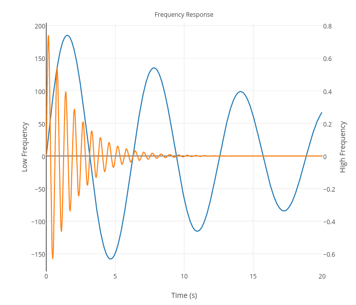
Convert your MATLAB® figures into online Plotly graphs with a single line of code:

 % Create some data for the two curves to be plotted
 x  = 0:0.01:20;
 y1 = 200*exp(-0.05*x).*sin(x);
 y2 = 0.8*exp(-0.5*x).*sin(10*x);

 % Create a plot with 2 y axes using the plotyy function
 figure;
 [ax, h1, h2] = plotyy(x, y1, x, y2, 'plot');

 % Add title and x axis label
 xlabel('Time (s)');
 title('Frequency Response');

 % Use the axis handles to set the labels of the y axes
 set(get(ax(1), 'Ylabel'), 'String', 'Low Frequency');
 set(get(ax(2), 'Ylabel'), 'String', 'High Frequency');

 %--PLOTLY--%
 p = fig2plotly; % <-- converts the yy-plot to an interactive, online version.

 %--URL--%
 % p.url = 'https://plot.ly/~matlab_user_guide/1522'

MATLAB® Contour Plot

Also, access other Plotly services and graphs programatically. Like, publication-quality image export:

 saveplotlyfig(p, 'testimage.svg')

and Plotly figure retrieval:

 p = getplotlyfig('chris', 1638) % downloads the graph data from https://plot.ly/~chris/1638

Documentation

This lives here: https://plot.ly/matlab

Maintainers

Contribute

Please do! This is an open source project. Check out the issues or open a PR!

We want to encourage a warm, welcoming, and safe environment for contributing to this project. See the code of conduct for more information.

License

MIT © 2017 Plotly, Inc.

Note that the project description data, including the texts, logos, images, and/or trademarks, for each open source project belongs to its rightful owner. If you wish to add or remove any projects, please contact us at [email protected].