SHISME / React Native Draggable Grid
A draggable and sortable grid of react-native
Stars: ✭ 137
Programming Languages
typescript
32286 projects
Projects that are alternatives of or similar to React Native Draggable Grid
React Native Star Rating
A React Native component for generating and displaying interactive star ratings
Stars: ✭ 724 (+428.47%)
Mutual labels: react-native-component
React Native Action Sheet Component
React Native Action Sheet Component for iOS & Android.
Stars: ✭ 60 (-56.2%)
Mutual labels: react-native-component
React Native Slot Machine
Text slot machine for react-native
Stars: ✭ 109 (-20.44%)
Mutual labels: react-native-component
React Native Stager
A performant wizard-like multi stages component for React Native without a router
Stars: ✭ 16 (-88.32%)
Mutual labels: react-native-component
React Arkit
AR library for React-Native based on ARKit
Stars: ✭ 57 (-58.39%)
Mutual labels: react-native-component
React Native Deck Swiper
tinder like react-native deck swiper
Stars: ✭ 1,261 (+820.44%)
Mutual labels: react-native-component
React Native Material Bottom Navigation
💅🔧👌 a beautiful, customizable and easy-to-use material design bottom navigation for react-native
Stars: ✭ 659 (+381.02%)
Mutual labels: react-native-component
React Native Design Utility
Utility for building design system in react-native. Idea from TailwindCSS
Stars: ✭ 116 (-15.33%)
Mutual labels: react-native-component
React Native Modal Dropdown
A react-native dropdown/picker/selector component for both Android & iOS.
Stars: ✭ 1,103 (+705.11%)
Mutual labels: react-native-component
React Native Barcode Scanner Google
Barcode scanner for react native, which implements barcode detection from Google's Vision API.
Stars: ✭ 105 (-23.36%)
Mutual labels: react-native-component
React Native Cached Image
CachedImage component for react-native
Stars: ✭ 890 (+549.64%)
Mutual labels: react-native-component
React Native Hide Show Password Input
React-Native Hide Show Password InputText Component
Stars: ✭ 50 (-63.5%)
Mutual labels: react-native-component
React Native Contacts
React Native Contacts
Stars: ✭ 1,369 (+899.27%)
Mutual labels: react-native-component
React Native Sglistview
SGListView is a memory minded implementation of React Native's ListView
Stars: ✭ 745 (+443.8%)
Mutual labels: react-native-component
React Native Push Notification Popup
A <NotificationPopup/> component for presenting your own push notification in react-native app
Stars: ✭ 111 (-18.98%)
Mutual labels: react-native-component
React Native Sortable List
React Native Sortable List component
Stars: ✭ 678 (+394.89%)
Mutual labels: react-native-component
React Native Ios Context Menu
A react-native component to use context menu's (UIMenu) on iOS 13/14+
Stars: ✭ 80 (-41.61%)
Mutual labels: react-native-component
React Native Thumbnail
Get thumbnail from local media. Currently, it only supports for video.
Stars: ✭ 122 (-10.95%)
Mutual labels: react-native-component
React Native Image Slider Box
A simple and fully customizable React Native component that implements an Image Slider UI.
Stars: ✭ 113 (-17.52%)
Mutual labels: react-native-component
React Native Otp Inputs
OTP inputs for React-Native
Stars: ✭ 101 (-26.28%)
Mutual labels: react-native-component
react-native-draggable-grid
-blue.svg)
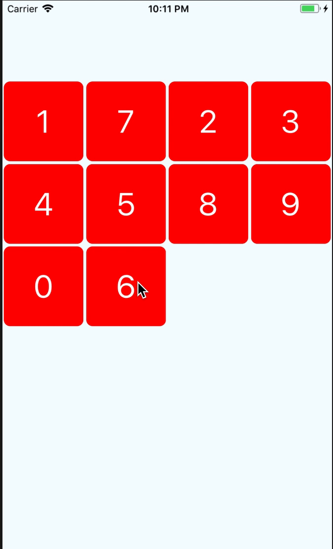
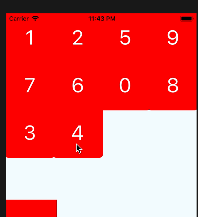
Demo
Getting Started
Installation
npm install react-native-draggable-grid --save
Usage
import React from 'react';
import {
  View,
  StyleSheet,
  Text,
} from 'react-native';
import { DraggableGrid } from 'react-native-draggable-grid';

interface MyTestProps {

}

interface MyTestState {
  data:{key:string, name:string}[];
}

export class MyTest extends React.Component<MyTestProps, MyTestState>{

  constructor(props:MyTestProps) {
    super(props);
    this.state = {
      data:[
        {name:'1',key:'one'},
        {name:'2',key:'two'},
        {name:'3',key:'three'},
        {name:'4',key:'four'},
        {name:'5',key:'five'},
        {name:'6',key:'six'},
        {name:'7',key:'seven'},
        {name:'8',key:'eight'},
        {name:'9',key:'night'},
        {name:'0',key:'zero'},
      ],
    };
  }

  public render_item(item:{name:string, key:string}) {
    return (
      <View
        style={styles.item}
        key={item.key}
      >
        <Text style={styles.item_text}>{item.name}</Text>
      </View>
    );
  }

  render() {
    return (
      <View style={styles.wrapper}>
        <DraggableGrid
          numColumns={4}
          renderItem={this.render_item}
          data={this.state.data}
          onDragRelease={(data) => {
            this.setState({data});// need reset the props data sort after drag release
          }}
        />
      </View>
    );
  }
}

const styles = StyleSheet.create({
  button:{
    width:150,
    height:100,
    backgroundColor:'blue',
  },
  wrapper:{
    paddingTop:100,
    width:'100%',
    height:'100%',
    justifyContent:'center',
  },
  item:{
    width:100,
    height:100,
    borderRadius:8,
    backgroundColor:'red',
    justifyContent:'center',
    alignItems:'center',
  },
  item_text:{
    fontSize:40,
    color:'#FFFFFF',
  },
});
Props
| parameter | type | required | description |
|---|---|---|---|
| numColumns | number | yes | how many items should be render on one row |
| data | array | yes | data's item must have unique key,item's render will depend on the key |
| renderItem | (item, order:number) => ReactElement | yes | Takes an item from data and renders it into the list |
| itemHeight | number | no | if not set this, it will the same as itemWidth |
| dragStartAnimation | object | no | custom drag start animation |
| style | object | no | grid styles |
Event Props
| parameter | type | required | description |
|---|---|---|---|
| onItemPress | (item) => void | no | Function will execute when item on press |
| onDragStart | (startDragItem) => void | no | Function will execute when item start drag |
| onDragRelease | (data) => void | no | Function will execute when item release, and will return the new ordered data |
| onResetSort | (data) => void | no | Function will execute when dragged item change sort |
| onDragging | (gestureState: PanResponderGestureState) => void | no | Function will execute when dragging item |
Item Props
| parameter | type | required | description |
|---|---|---|---|
| disabledDrag | boolean | no | It will disable drag for the item |
| disabledReSorted | boolean | no | It will disable resort the item |
if you set disabledResorted be true, it will look like that
Custom Drag Start Animation
If you want to use your custom animation, you can do like this
 render() {
    return (
      <View style={styles.wrapper}>
        <DraggableGrid
          numColumns={4}
          renderItem={this.render_item}
          data={this.state.data}
          onDragStart={this.onDragStart}
          dragStartAnimation={{
            transform:[
              {scale:this.state.animatedValue}
            ],
          }}
        />
      </View>
    );
  }

  private onDragStart = () => {
    this.state.animatedValue.setValue(1);
    Animated.timing(this.state.animatedValue, {
      toValue:3,
      duration:400,
    }).start();
  }
Resort item
if you want resort item yourself,you only need change the data's sort, and the draggable-grid will auto resort by your data.
the data's key must unique
Note that the project description data, including the texts, logos, images, and/or trademarks,
for each open source project belongs to its rightful owner.
If you wish to add or remove any projects, please contact us at [email protected].