liloow / Vue Draggablecal
Not your ordinary datepicker. A Vuejs draggable date selector with a fresh responsive design, mobile ready and 0 dependencies, 17kb gzipped
Stars: ✭ 79
Projects that are alternatives of or similar to Vue Draggablecal
Vue Ctk Date Time Picker
VueJS component to select dates & time, including a range mode
Stars: ✭ 707 (+794.94%)
Mutual labels: calendar, datepicker, vue-component, responsive
Core Components
Accessible and lightweight Javascript components
Stars: ✭ 85 (+7.59%)
Mutual labels: lightweight, calendar, datepicker
Vue Hotel Datepicker
Vue date range picker component
Stars: ✭ 665 (+741.77%)
Mutual labels: calendar, datepicker
Ion2 Calendar
📅 A date picker components for ionic2 /ionic3 / ionic4
Stars: ✭ 537 (+579.75%)
Mutual labels: calendar, datepicker
React Modern Calendar Datepicker
A modern, beautiful, customizable date picker for React
Stars: ✭ 555 (+602.53%)
Mutual labels: calendar, datepicker
Calendarview
An Easy to Use Calendar for iOS (Swift 5.0)
Stars: ✭ 429 (+443.04%)
Mutual labels: calendar, datepicker
Vue Responsive Calendar
A responsive calendar component for Vue.js
Stars: ✭ 17 (-78.48%)
Mutual labels: calendar, vue-component
Vue Flatpickr Component
Vue.js component for Flatpickr datetime picker 📆
Stars: ✭ 773 (+878.48%)
Mutual labels: datepicker, vue-component
Rsdayflow
iOS 7+ Calendar (Date Picker) with Infinite Scrolling.
Stars: ✭ 843 (+967.09%)
Mutual labels: calendar, datepicker
Lity
Lightweight, accessible and responsive lightbox.
Stars: ✭ 1,051 (+1230.38%)
Mutual labels: lightweight, responsive
Angular Moment Picker
Angular Moment Picker is an AngularJS directive for date and time picker using Moment.js.
Stars: ✭ 536 (+578.48%)
Mutual labels: calendar, datepicker
Vue2 Calendar
vue 2.x calendar component
Stars: ✭ 477 (+503.8%)
Mutual labels: calendar, vue-component
Litepicker
Date range picker - lightweight, no dependencies
Stars: ✭ 442 (+459.49%)
Mutual labels: lightweight, datepicker
React Calendar
A React Native inspired date list renderer
Stars: ✭ 34 (-56.96%)
Mutual labels: calendar, datepicker
Laydate
layDate(日期与时间组件) 是 layui 独立维护的三大组件之一
Stars: ✭ 1,066 (+1249.37%)
Mutual labels: calendar, datepicker
Horizontal Calendar
A material horizontal calendar view for Android based on RecyclerView
Stars: ✭ 1,155 (+1362.03%)
Mutual labels: calendar, datepicker
React Infinite Calendar
✨ Infinite scrolling date-picker built with React, with localization, range selection, themes, keyboard support, and more.
Stars: ✭ 3,828 (+4745.57%)
Mutual labels: calendar, datepicker
Vue Gallery
📷 Responsive and customizable image and video gallery, carousel and lightbox, optimized for both mobile and desktop web browsers.
Stars: ✭ 405 (+412.66%)
Mutual labels: mobile, vue-component
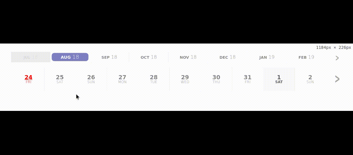
DraggableCal
A datepicker Vue component. Compatible with Vue 2.x
Demo
To view a demo online: demo
To view demo examples locally clone the repo and run npm i && npm serve --open App.vue
What the future holds
I am planning to add a few more customizations props in the near future, but I don't let my lack of imagination/creativity stop yours ! I strongly encourage you ton open Issues or pull requests if you have any ideas/needs that you'd like to see added to the component !
- [ ] Add more languages
- [ ] Add props for easy custom styling
- [x]
Add the possibility to append years as well - [ ] Optimize the Array of days rendered
Install
npm i vue-draggable-cal --save
or
yarn add vue-draggable-cal
import DraggableCal from 'vue-draggable-cal';

export default {
  // ...
  components: {
    DraggableCal,
  },
  // ...
};
Or use directly from a CDN
<div id="app">
  <DraggableCal></DraggableCal>
</div>
<script src="https://unpkg.com/vue"></script>
<script src="https://unpkg.com/vue-draggable-cal"></script>
<script>
new Vue({
  el: '#app',
  components: {
    DraggableCal,
  }
})
</script>
Usage
<draggable-cal></draggable-cal>

<!-- OR -->

<DraggableCal></DraggableCal>
Emits events
<DraggableCal @selectedDate="doSomething($event)"></DraggableCal>
Available props
| Prop | Type | Default | Description |
|---|---|---|---|
| days | Number | 365 | Number of days to append |
| months | Number | 12 | Numbers of months to append (has precedence over days if custom set) |
| years | Number | 0 | Number of years to append and enable year mode (see Demo ) |
| prependedYears | Number | 0 | Number of years to preppend. Note: this prop is ignored if years is not set |
| prependedMonths | Number | 1 | Number of month to preppend |
| disabledWeekDays | Object | {} | Disable a specific week day by setting it's day number to true. ie. {0: true} will disable sundays |
| disabledDates | Array | [] | Disable a specific date. Format of the day should be a string YYYY-MM-DD ie. ['2018-01-01']
|
| pastIsDisabled | Boolean | true | Allows the selection of alreay past days and predend the days of prepended months |
| fullMonths | Boolean | false | Weither or not to always use complete months (i.e. days=1 if set to true the whole month is going to be appended) |
| accentColor | String | #00008b | Set the accent color (HEX or CSS color names) |
| lang | String | EN | Language (see available in Transations) |
Events
These events are emitted on actions in the datepicker
| Event | Output | Description |
|---|---|---|
| selectedDate | Object | A date has been selected. It outputs an object : formatedDate: String of the date andraw: An array of [YYYY, MM, DD] that can be used to build the date object via Date.UTC(YYYY,MM,DD)
|
| dateCleared | null | The previously selected date has been unselected by the user |
Available languages
| Abbr | Language | |
|---|---|---|
| EN | English | Default |
| FR | French |
Dev & Build
Dev server
yarn serve # Or npm run serve
Build App
yarn build # Or npm run build
Build Lib
yarn bundle # Or npm run bundle
License
MIT
Thanks
Credits to @webAngelo for his range-calendar from which this is highly inspired.
Note that the project description data, including the texts, logos, images, and/or trademarks,
for each open source project belongs to its rightful owner.
If you wish to add or remove any projects, please contact us at [email protected].