All Projects → gampleman → Elm Visualization

gampleman / Elm Visualization

Licence: mit
A data visualization library for Elm

Programming Languages

elm
856 projects

Projects that are alternatives of or similar to Elm Visualization

Bap
Bayesian Analysis with Python (Second Edition)
Stars: ✭ 379 (-19.19%)
Mutual labels:  data-visualization
Cubesviewer
Explore and visualize analytical datasets
Stars: ✭ 416 (-11.3%)
Mutual labels:  data-visualization
Plotly
Plotly for Rust
Stars: ✭ 433 (-7.68%)
Mutual labels:  data-visualization
Dash Table
A First-Class Interactive DataTable for Dash
Stars: ✭ 382 (-18.55%)
Mutual labels:  data-visualization
Pywaffle
🧇 Make Waffle Charts in Python.
Stars: ✭ 406 (-13.43%)
Mutual labels:  data-visualization
Aachartcore
📈📊☕️☕️☕️An elegant modern declarative data visualization chart framework for Android. Extremely powerful, supports line, spline, area, areaspline, column, bar, pie, scatter, angular gauges, arearange, areasplinerange, columnrange, bubble, box plot, error bars, funnel, waterfall and polar chart types.极其精美而又强大的 Android 数据可视化图表框架,支持柱状图、条形图、折线图、曲线图、折线填充图、曲线填充图、气泡图、扇形图、环形图、散点图、雷达图、混合图等各种类型的多达几十种的信息图图表,完全满足工作所需.
Stars: ✭ 424 (-9.59%)
Mutual labels:  data-visualization
Sqlpad
Web-based SQL editor run in your own private cloud. Supports MySQL, Postgres, SQL Server, Vertica, Crate, ClickHouse, Trino, Presto, SAP HANA, Cassandra, Snowflake, BigQuery, SQLite, and more with ODBC
Stars: ✭ 4,113 (+776.97%)
Mutual labels:  data-visualization
Reactochart
📈 React chart component library 📉
Stars: ✭ 459 (-2.13%)
Mutual labels:  data-visualization
Rweekly.org
R Weekly
Stars: ✭ 406 (-13.43%)
Mutual labels:  data-visualization
Sjplot
sjPlot - Data Visualization for Statistics in Social Science
Stars: ✭ 432 (-7.89%)
Mutual labels:  data-visualization
Chartfun
🎲数据大屏可视化编辑器
Stars: ✭ 394 (-15.99%)
Mutual labels:  data-visualization
Chart Race React
📊 Seamless bar chart race component for React.
Stars: ✭ 406 (-13.43%)
Mutual labels:  data-visualization
Py d3
D3 block magic for Jupyter notebook.
Stars: ✭ 428 (-8.74%)
Mutual labels:  data-visualization
Ggsci
🦄 Scientific journal and sci-fi themed color palettes for ggplot2
Stars: ✭ 381 (-18.76%)
Mutual labels:  data-visualization
Teaching
Teaching Materials for Dr. Waleed A. Yousef
Stars: ✭ 435 (-7.25%)
Mutual labels:  data-visualization
Openspace
This is the official GitHub repository for OpenSpace: an open source astrovisualization project. For instructions on how to build and run OpenSpace, see the Getting Started Guides on the wiki page at http://wiki.openspaceproject.com
Stars: ✭ 374 (-20.26%)
Mutual labels:  data-visualization
Flutter echarts
A Flutter widget to use Apache ECharts (incubating) in a reactive way.
Stars: ✭ 420 (-10.45%)
Mutual labels:  data-visualization
Book Socialmediaminingpython
Companion code for the book "Mastering Social Media Mining with Python"
Stars: ✭ 462 (-1.49%)
Mutual labels:  data-visualization
Courses
Quiz & Assignment of Coursera
Stars: ✭ 454 (-3.2%)
Mutual labels:  data-visualization
Turnilo
Business intelligence, data exploration and visualization web application for Druid, formerly known as Swiv and Pivot
Stars: ✭ 427 (-8.96%)
Mutual labels:  data-visualization

Elm-visualization

Docs | Examples | GitHub | Changelog | #visualization on Elm slack

This project is designed to give you all the tools needed to build data visualizations. It is not a charting library in the sense that you have pre-bundled Excel-style charts, but it should contain all the tools to make building such charts relatively easy. The advantage is that you are free to design and build data visualizations that uniquely suite your needs.
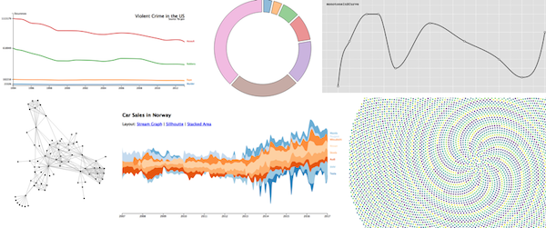
Learn by example

Examples

Getting started

You will need to have elm installed. Then run:

elm init
elm install gampleman/elm-visualization

However, there are other packages that you will likely need to produce a visualization. Which depends somewhat on what you want to achieve, here are some common ones:

You can use this Ellie to run the examples, since it has all the dependencies already installed into it.

What's included?

Scales

Most of the time you have data that has properties that you want to display on the screen, however these properties typically aren't in pixels. Scales solve this fundamental problem by giving you convenient ways to transform raw data into positions, sizes, colors, labels and other ways to display data.

Axis

A component that allows you to visualize a Scale. Those little ticks that describe the dimensions of a plot.

Shapes

This module gives you ways to draw some fundamental shapes used in data visualization, including lines (as in line or area charts), as well as arcs (as in pie charts).

Force Layout

Use a simulation of physical forces to do layout. Suitable for i.e. network graphs.

Interpolation

Smoothly transition between pairs of values. Useful for animation, or generating gradients of values.

Transition

Build complex animations using Interpolation.

Histogram

Compute histograms of data.

Zoom

Build pan and zoom user interactions.

Statistics

Process data to extract useful insights for visualizations.

Acknowledgements

Heavily inspired by parts of the D3 library by Mike Bostock. However since Elm provides a great DOM abstraction already, selections are not part of this library.

Contributing

This library is still under active development, so please submit feature requests iff you are also willing to implement them. Bug reports are welcome.

Note that the project description data, including the texts, logos, images, and/or trademarks, for each open source project belongs to its rightful owner. If you wish to add or remove any projects, please contact us at [email protected].