All Projects → hd-motion → flutter_stepo

hd-motion / flutter_stepo

Licence: Apache-2.0 license
Flutter package for animated unit stepper.

Programming Languages

dart
5743 projects
kotlin
9241 projects
swift
15916 projects
objective c
16641 projects - #2 most used programming language

Projects that are alternatives of or similar to flutter stepo

Bs Stepper
A stepper for Bootstrap 4.x
Stars: ✭ 261 (+1034.78%)
Mutual labels:  stepper
Stepbarview
Step Bar View (make your own customized StepBar)
Stars: ✭ 97 (+321.74%)
Mutual labels:  stepper
Materialstepperview
Steppers - Material Design Components for Android
Stars: ✭ 2,187 (+9408.7%)
Mutual labels:  stepper
Materialdesignextensions
Material Design Extensions is based on Material Design in XAML Toolkit to provide additional controls and features for WPF apps
Stars: ✭ 516 (+2143.48%)
Mutual labels:  stepper
Vue Stepper
👨🏻‍🚀 A renderless component for composing a Stepper
Stars: ✭ 90 (+291.3%)
Mutual labels:  stepper
React Stepper
Well-designed stepper component for react
Stars: ✭ 108 (+369.57%)
Mutual labels:  stepper
ngx-copilot
🏆 The most expected has arrived, a package for Angular that facilitates us to improve the experience of our users when guiding them in our interface
Stars: ✭ 61 (+165.22%)
Mutual labels:  stepper
Tmcstepper
Stars: ✭ 237 (+930.43%)
Mutual labels:  stepper
Material Steppers
Angular Steppers directive for Angular Material
Stars: ✭ 95 (+313.04%)
Mutual labels:  stepper
Kwstepper
A stepper control with flexible UI and tailored UX.
Stars: ✭ 168 (+630.43%)
Mutual labels:  stepper
Steppers
Steppers view library for Android, based on Google Material design guidelines
Stars: ✭ 786 (+3317.39%)
Mutual labels:  stepper
Easystepindicator
More attributes for a step indicator, indicates steps with a easy way
Stars: ✭ 78 (+239.13%)
Mutual labels:  stepper
React Native Input Spinner
An extensible input number spinner component for react-native highly customizable. This component enhance a text input for entering numeric values, with increase and decrease buttons.
Stars: ✭ 155 (+573.91%)
Mutual labels:  stepper
Stepper
Animated numeric stepper component which can be used to increment or decrement a value by clicking arrows.
Stars: ✭ 351 (+1426.09%)
Mutual labels:  stepper
Teensystep
Fast Stepper Motor Library for Teensy boards
Stars: ✭ 191 (+730.43%)
Mutual labels:  stepper
react-native-simple-stepper
A super simple react-native implementation of the UIStepper control from iOS.
Stars: ✭ 100 (+334.78%)
Mutual labels:  stepper
Ode4j
Java 3D Physics Engine & Library
Stars: ✭ 105 (+356.52%)
Mutual labels:  stepper
Processloadingview
ProcessLoadingView is a step indicator loading animation built using CABasicAnimation
Stars: ✭ 251 (+991.3%)
Mutual labels:  stepper
Materialize Stepper
A little plugin that implements a stepper to Materializecss framework.
Stars: ✭ 212 (+821.74%)
Mutual labels:  stepper
React Use Wizard
🧙 A React wizard (stepper) builder without the hassle, powered by hooks.
Stars: ✭ 162 (+604.35%)
Mutual labels:  stepper

stepo

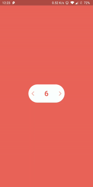
A highly customisable Flutter package for animated unit stepper

Supported Dart Versions

Dart SDK version >= 2.1.0

Demo Gif

Stepo Demo

Installation

Pub

Add the Package

dependencies:
  stepo: ^1.0.0

How to use

Import the package in your dart file

import 'package:stepo/stepo.dart';
Basic usage :
Stepo(
  key: UniqueKey(),
),

Note: For stepo to show instant changes on hot reload, you need to provide UniqueKey() so that the widget rebuilds every time.

Customisable usage :
Stepo(
  key: UniqueKey(),
  width: 200,                                         //Optional
  backgroundColor: Colors.deepPurple,                 //Optional
  style: Style.vertical,                              //Optional
  textColor: Colors.white,                            //Optional
  animationDuration: Duration(milliseconds: 500),     //Optional
  iconColor: Colors.white,                            //Optional
  fontSize: 20,                                       //Optional
  iconSize: 30,                                       //Optional 
  initialCounter: 25,                                 //Optional
  lowerBound: 10,                                     //Optional
  upperBound: 50,                                     //Optional
  onIncrementClicked: (counter) {                     //Optional
    print("Increment clicked");
  },
  onDecrementClicked: (counter) {                     //Optional
    print("Decrement clicked");
  },
),

Customisable fields

Attribute Type Default Value
width int 160
backgroundColor color Colors.white
style vertical/horizontal Style.horizontal
textColor color Color(0xffEC645B)
animationDuration int Duration(milliseconds: 200)
iconColor color Color(0xffEC645B)
fontSize int 32
iconSize int 40
initialCounter int 0
lowerBound int 0
upperBound int 100
onIncrementClicked function (counter) {}
onDecrementClicked function (counter) {}

Inspired by

Oleg Frolov's Design

Created & Maintained By

Harpreet Singh

Damanpreet Singh

License

Copyright 2020 Harpreet Singh & Damanpreet Singh

Licensed under the Apache License, Version 2.0 (the "License");
you may not use this file except in compliance with the License.
You may obtain a copy of the License at

http://www.apache.org/licenses/LICENSE-2.0

Unless required by applicable law or agreed to in writing, software
distributed under the License is distributed on an "AS IS" BASIS,
WITHOUT WARRANTIES OR CONDITIONS OF ANY KIND, either express or implied.
See the License for the specific language governing permissions and
limitations under the License.
Note that the project description data, including the texts, logos, images, and/or trademarks, for each open source project belongs to its rightful owner. If you wish to add or remove any projects, please contact us at [email protected].